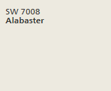
For some time Alabaster SW 7008 has been a hot color. I’ve used it both inside and out for walls, trim and painted brick. Inside Alabaster reads a soft white, while outside it typically comes across much brighter. This is the tale of Alabaster used on two exteriors with very different results.
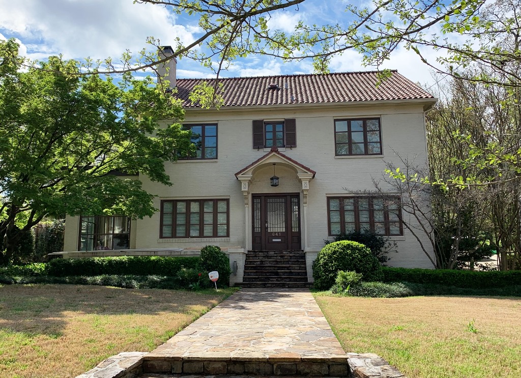
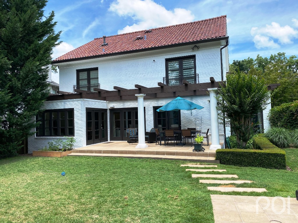
In March of this year, just as Coronavirus was shutting everything down, I received a call from Gary in Atlanta who needed help. He was about to paint his home’s brick exterior and wanted to make sure he selected the right color. Here is what his home looked like when I arrived for the consultation:
It was a beautiful, stately home on a lovely lot, but the house was lackluster. It needed brightening to show it off to its full potential.
Gary, Santi and I spent quite a bit of time looking at various shades of white. The only thing we were bound by was the tiled roof, which is reddish brown. The trick was to go bright enough with the paint color to give the desired effect without going too stark white. After sampling many whites on both front and back of the house, we decided on Alabaster SW 7008 for body and trim, Black Fox SW 7020 for the windows, gutters and downspouts and Spicewood SW 3021 for the wood stain, which covered a considerable surface on the backside of the home.
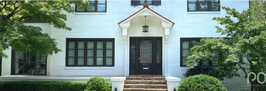
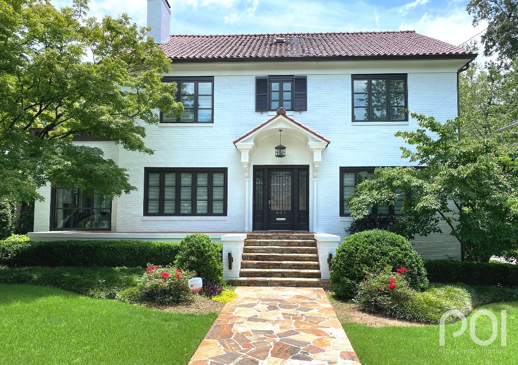
And here is the beautiful “after”:
Notice how nicely the Spicewood stain plays to the Black Fox trim. And the Alabaster is just the right hue of white without being over the top. Gary and Santi were very pleased. So pretty!
But now for another take on Alabaster.
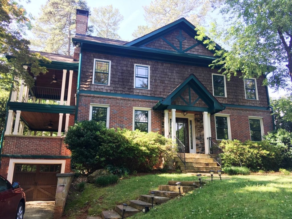
In May I received a call from Jenn in Decatur. She and her husband had just purchased a new house and wanted to paint the exterior before moving in. Here is what it looked like initially:
Jenn wanted to paint the brick and cedar shakes to unify the elements. I concurred. And, needless to say, we both thought lighter and brighter was in order. The dark, green trim was puzzling, but that was about to change.
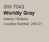
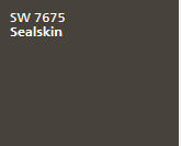
After much labor as to “which white,” we decided on Shoji White SW 7042 for the body, Worldly Gray SW 7043 for the trim and Sealskin SW 7675 for gutters, downspouts and window sashes.
On a side note, yes, I realize the body and trim colors are very close, but I told Jenn this is a totally “on trend” look today. It’s personal preference as to how much contrast you want between body and trim as long as you have the right hues, and we did look at more contrast, but Jenn liked what is shown here.
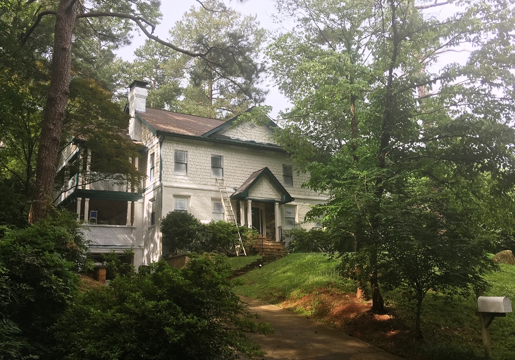
But a funny thing happened along the way. I got a “help me” text from Jenn while the painting was underway. Here is the photo she sent me:
Her concern was that the Shoji White was not reading white enough. Do you know why? It’s because of all the greenery surrounding the house in trees, shrubbery and grass. The cast-off color was affecting the paint color.
TIP: If you have a very wooded lot, you will probably want to use a brighter white than what you would normally choose. The cast-off light will turn the paint color.
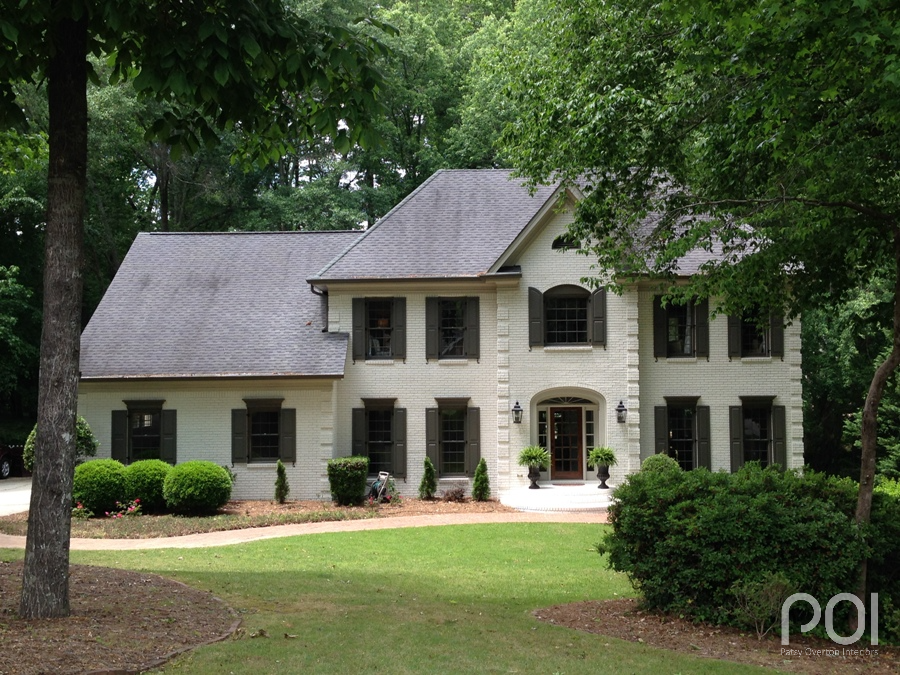
In comparison, here is another home painted in Shoji White.
The difference is remarkable. Although the home shown above is also on a wooded lot, it does not sit up on top of a hill like Jenn’s with green reflecting from every angle. See more on this transformation here.
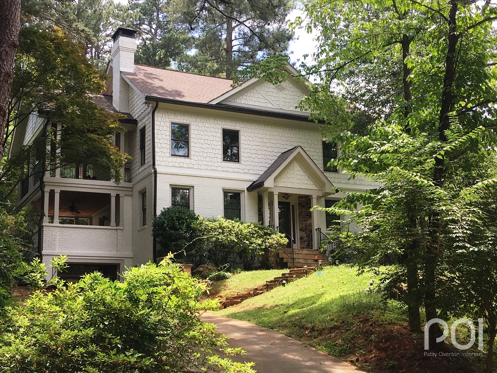
Back to Jenn’s home…. for the second coat of paint, she switched to Alabaster SW 7008 for a brighter white. Here is the finished product:
The paint color is definitely lighter here than in the Shoji White photo, but still doesn’t read nearly as bright white as on Gary’s home in the first illustration; however, I think the softer white is just right for this home in this setting. A brighter white would’ve been too contrasting against the softness of the natural elements that surround and rise above the home.
Jenn’s home, like Gary’s, was beautifully transformed with Alabaster, only with very different results. I want to thank both of them for sharing their photos with me and allowing me to tell their stories.
