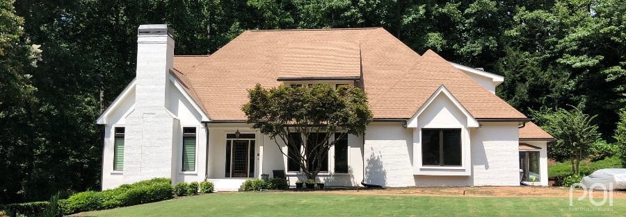
If you have been wondering what’s trending in Atlanta exteriors, you’ve come to the right place.
You may be asking yourself, “Is white still in?” The answer is YES — both inside and out.
It was a couple of years ago — in the fall of 2016 — that four major paint companies all came out with whites as their “Color of the Year.”
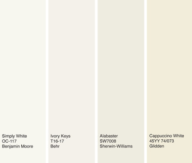
They were right on track, as whites have been all the rage ever since — white kitchens, white bathrooms, white walls, white brick, white everything. I still work with clients every day who are looking for the “right white” for their homes.
So it should come as no surprise that several exteriors I will show you today are white — with a few surprises thrown in. Ready?
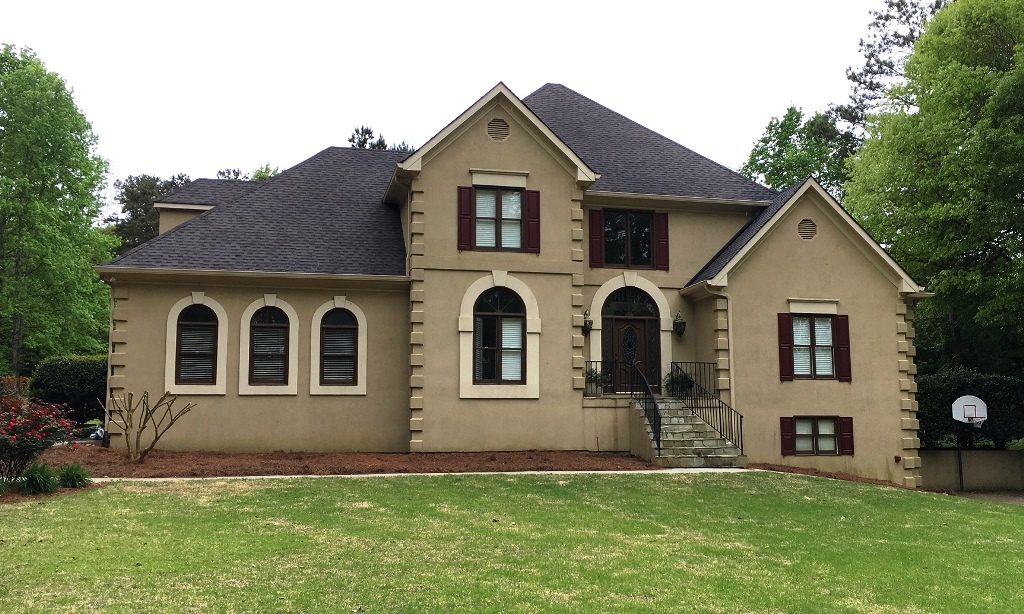
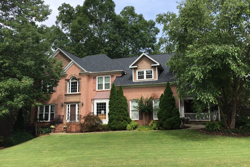
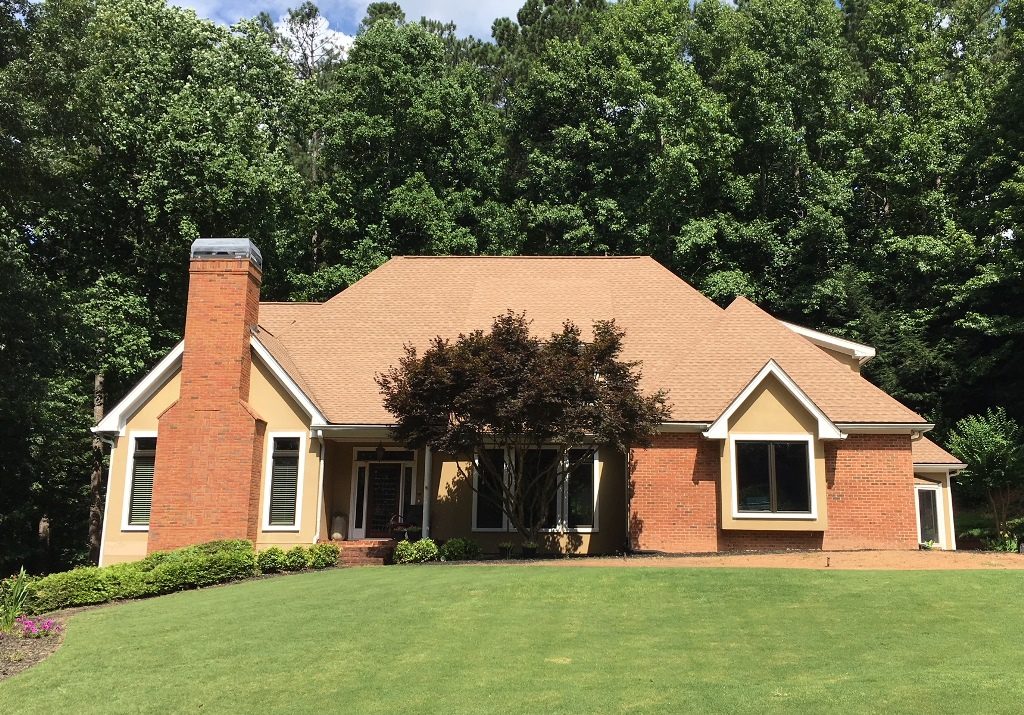
First, let’s take a look at John & Angie’s stucco home in Buford.
When I arrived at the house several months ago Angie told me, “I want a white house.” I smiled. There are several problems with the paint job you see above — mainly that the brownish/tan is dated and the brown accents have no relation to the blackish roof. They fight each other.
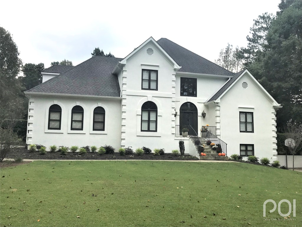
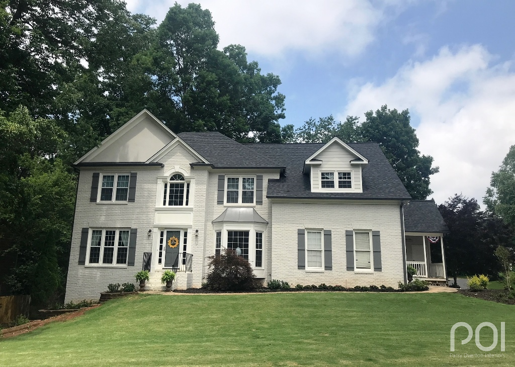
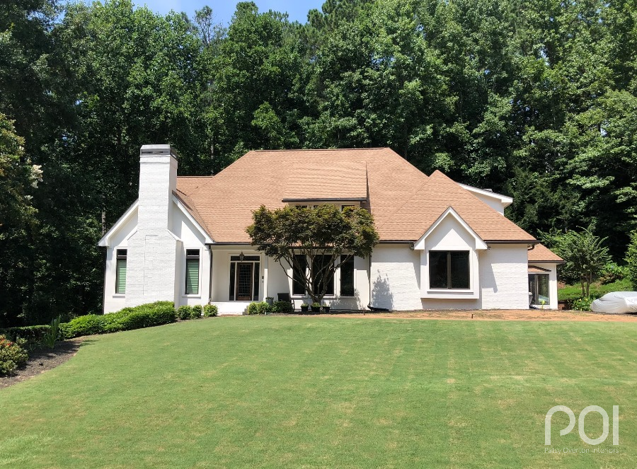
We worked diligently to come up with a white she was happy with, and also a dark accent color. After a fresh coat of paint the house was transformed.
In addition to the beautiful white, notice how the dark Iron Ore SW 7069 accents tie in to the roof color. Also, you may have noticed the shutters were removed and not replaced — another updated touch. Nicely done, John & Angie! (Special thanks to John for diligently working with me to provide a good “after” shot. I know I can be a pain, but he was gracious.)
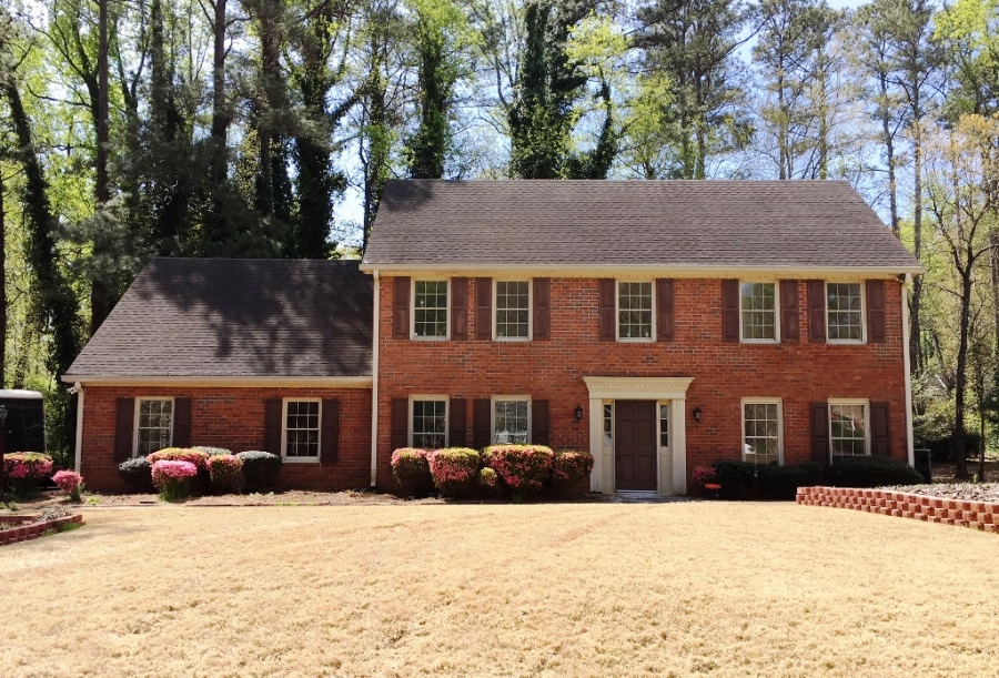
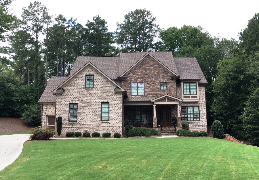
It was in June of 2017 that I met with Deniece and James, although they didn’t send “after” shots until a few months ago. Something about wanting to get their new landscaping in 🙂 I understand. They wanted to paint their brick so, once again, I was a happy camper. Here is the “before”:
Yes, it’s a nice traditional home but in need of a face-lift. The brown stucco is left over from the Tuscan era of 8-10 years ago, and the reddish accents don’t show up against the brick. They wanted to paint the brick something light, but not necessarily white. We decided on Agreeable Gray SW 7029 for the body with white trim and (warm) gray accents. Take a look:
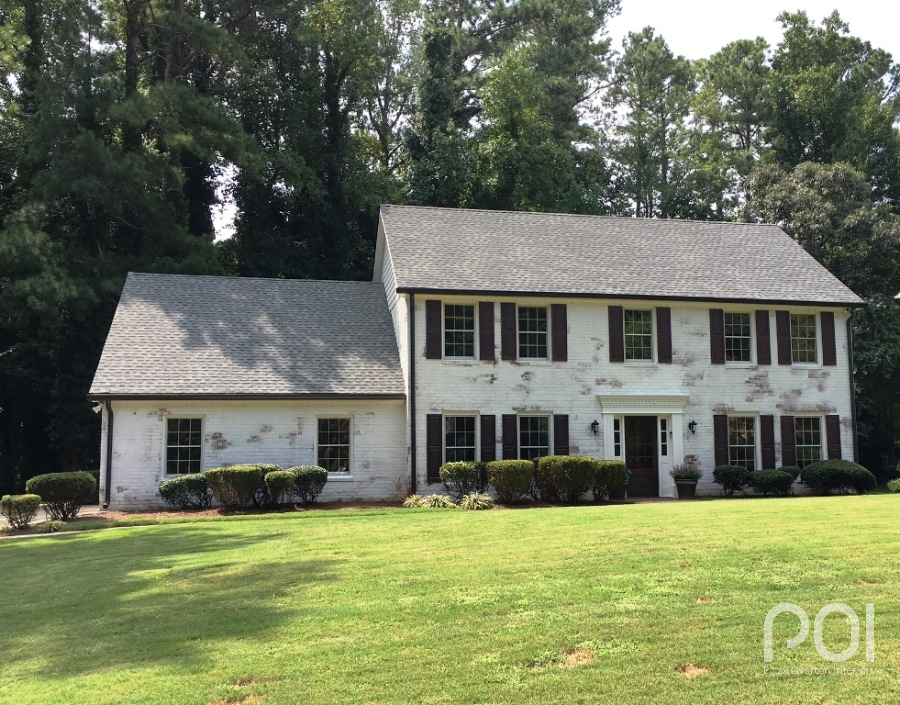
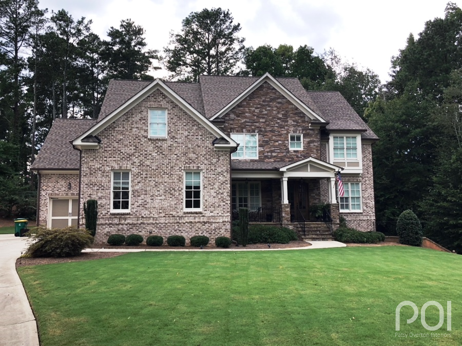
I love the way the off-white, grayish body and gray accents tie in beautifully with the roof, whereas before it was sort of hanging out there alone amongst all the reddish/brown tones. They also added stylish board & batten shutters and dark gray gutters and downspouts. Soft grays and taupes are definitely trending in Atlanta exteriors.
Deniece followed up with… “Finally!! Here are the pics. We LOVE IT! Remember the ugly brown siding and pink brick eyesore you visited us in last fall? Well this is the finished product. THANK YOU!!!!”
Next I want to show you a different treatment. My contractor buddy, Mark Victor of Building and More, called in April for help with a home he had purchased to renovate and sell. We spent most of our time that day on the interior of the home, but today I want to show you the exterior. Here is what I saw when I arrived in April:
Mark said he was going to “limewash” the house which calls for using lime paint. It is not acrylic or petroleum based, but derived from sustainable materials, creating a natural, breathable paint. The lime paint is applied by a paint applicator to a damp surface, then washed off to create the antique look such as you see in historic Europe created over many years. Mark used the Romabio product which is available in over 200 colors.
Isn’t that stunning? Mark did a fabulous job of painting the shutters, gutters and downspouts in a hue that ties beautifully to the bleeding brick and roof. The lime paint can be washed off to whatever degree pleases the homeowner. I’ve seen limewashed homes before with a much more aged looked, but I think this is perfect for this particular home and neighborhood. Great job, Mark!
Want to see more of this beautifully remodeled home in Marietta? Take a look here.
Ok, let’s take a look at a subtle change on another Marietta home:
Jill and Charlie called to say, “Help! A color consultant from the paint store just left and we are more confused now than we were when she got here. When can you come?”
In this case, they were looking for subtle changes. As you can see above, the colors they had on the home were well coordinated with the brick and stone. So what’s the problem? They were tired of the dark trim with super dark color on the window sashes and wanted a lighter, brighter, fresher look.
I whipped out the fan deck and we got to work. It was all about finding a nice taupe that would be lighter, still work well with the brick & stone, and not turn pink as the current color did. I thought the dark gutters and downspouts should stay as they were since that look is totally on trend and blends well with their fixed elements. We ended up going with Natural Tan SW 7567 for the trim and sashes and Moth Wing SW 9174 for the contrasting color on the garage doors and underneath the windows to the right.
This is a great example of giving a home a facelift through subtle changes. Lighter, brighter trims are also trending in Atlanta exteriors. I’ve done a number of houses recently with that look.
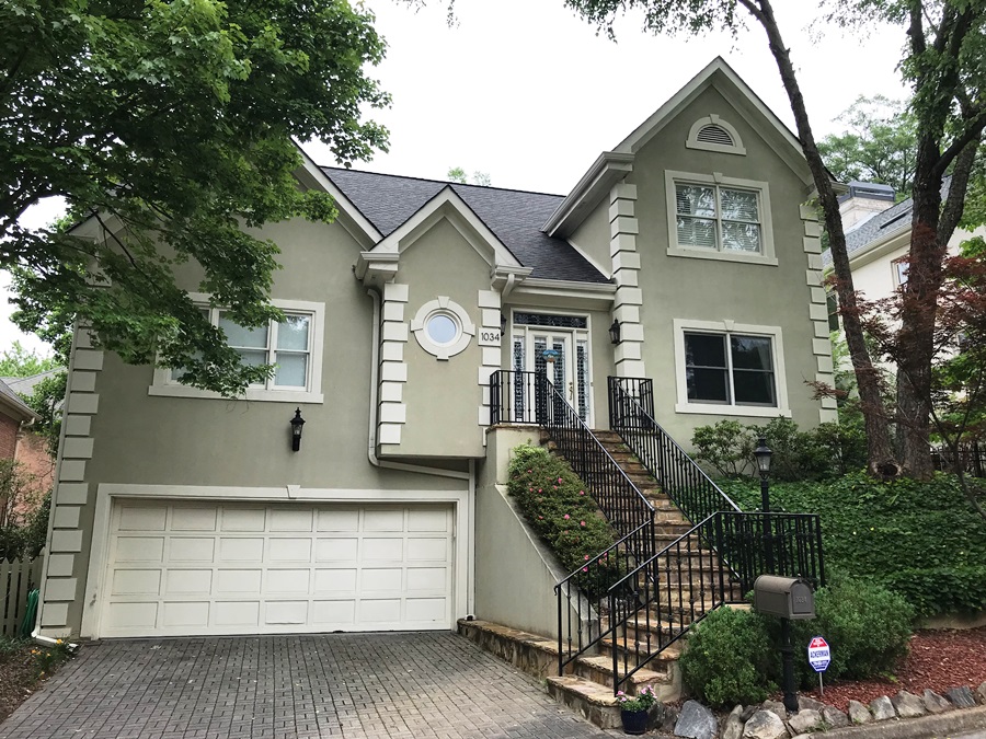
Next, let’s take a look at Andy & Lacy’s stucco home in Atlanta.
When I first saw this home, I knew it should have a more distinguished look. While the sage green was okay and played well to the charcoal roof, black wrought iron railing and off-white trim, I thought it could be much more striking and have a stronger presence. Since Andy & Lacy weren’t settled on a particular look, they let me do my thing.
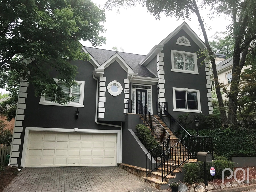
We settled on Gauntlet Gray SW 7019 for the body and Alabaster SW 7008 for the trim. (You will find that I use Alabaster frequently. Why? Because it’s a beautiful white that is not too bright and not too yellow. It has a softness that makes it appropriate for MANY occasions that call for white.) Also, the garage door was not to be painted as it was new and had a baked enamel finish. We wanted a white trim that would work ok with the door without being too yellow.
See what I mean about a stronger presence? In addition to the dark gray and white, we also used black for the front door to tie back to the railing and roof.
Our next house is in Dunwoody and belongs to Andrea & Sean.
Sean and Andrea love modern. Unfortunately, their house is not. It is a lovely brick and stone ranch, but definitely not modern. Their dream was for a white house with dark accents. Painting both the stucco and brick on this home was a GREAT idea, as the house looks very disjointed otherwise. When I got there they already had new windows with a white facing and dark, metal sashes, so the transformation had begun.
We decided on Aesthetic White SW 7035 for the body. Why? Aesthetic White has a touch of brown which we needed to play to the roof. Also, for the gutters and downspouts, we went with Black Fox SW 7020. It is a brownish black that worked well with the sash color.
And the reveal…..
I smile when I look at this. Now their home is unified and much more toward a modern look. Also, the painted gutters and downspouts were the right touch to tie in the window sashes. This lovely paint job was done by Brett Guggenheim, CertaPro of Dunwoody franchise owner.
How about a commercial building for the grand finale?
It was in July of 2017 that I met with Pam at the site of her family’s business, MECO, in Doraville. (MECO is a full line petroleum and industrial equipment supplier.) Here is what I saw that day:
As you can see, the body is yellow beige which doesn’t have that fresh look of today. I knew we needed to go with a neutral that was more toward taupe. We selected Anew Gray SW 7030, but later revised it to one shade darker, Mega Greige SW 7031.
We next selected a trim color for the windows and door facing — Sealskin SW 7675. This is a dark brownish/black that works well for gutters & downspouts as well on both residential and commercial properties.
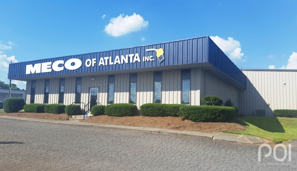
Finally, we had to decide which color to use for the accent which was going to produce the “wow” factor for this property. I asked to see the company logo. Why? Any marketing guru will tell you that the look should be seamless and unified for anything you produce pertaining to your company. That should carry through to the exterior of the property in some way. When I saw the deep, dark navy blue of their logo, I knew we must use that to accent the building. Shown below is Anchors Aweigh SW 9179 used as a backdrop to the company lettering in white.
When I asked Pam how they liked the new look, she told me her mother cried when she saw the freshly painted building. (I think they were tears of joy!) Painting was done by CertaPro of Duluth.
So, to wrap it up, whites are still trending in Atlanta exteriors, but we are not bound by them. Colors are shifting from grays to warmer taupes and from heavy to light. Having said that, there are always exceptions such as with the dark gray home. So what’s the answer? As long as the paint colors you want to use work with the unchanging elements of your home, go with what you like.
Need professional help with color? 770-843-2307
