Are you searching high and low for the perfect front door color? How do you know if you should use something muted or bright, black or white, or anything else that you just happen to like? What are the parameters for selecting a front door color?
A month or so ago I met with Dave in Sandy Springs for both an interior and exterior color consultation. We first worked outside. Once we had decided on the body, trim and shutter colors, he asked about his front door, which was painted red. I recommended that he update it to something else but he replied, “I love my red front door.” I told him it was his house and if he wanted to keep the red front door, that’s what he should do.
Then a few weeks later I received this note from him:
Now that I’ve seen the house as it is with the red door… well, you were right!!! Can you give me your recommendations for colors for the front door? I’d like to consider options… should it be dark, a bright pop of color or similar to other colors? Would the color of the shutters be an option?
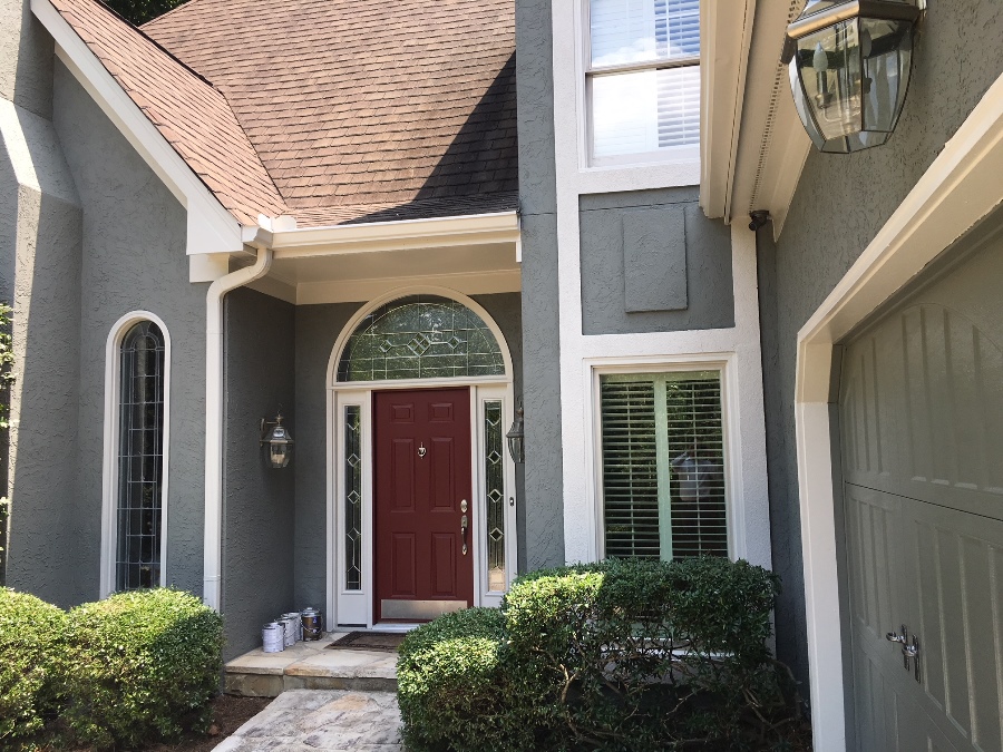
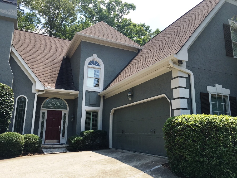
Here are pictures of Dave’s freshly painted home showing both the red front door and the shutters.
My response:
After taking a look, my one and only recommendation for a front door color is to paint it to match the shutters, and here’s why…
With the new color palette, we’ve created a crisp, clean “tuxedo” look and given your home much more distinction. The shutter color looks great as a deep accent and ties in well with the roof color – plus, you love it with the body color. It’s the perfect counter punch to the off-white trim. Putting a “pop of color” on your front door would completely bring it down. Colorful front doors work best on homes that have a more casual appearance. That may have been the case on your home before the new paint job, but not now. Using the dark shutter color on the front door is the only way to go to solidify the stately new look and complete the tailored appearance from start to finish. If you need a pop of color, put a fabulous piece of artwork in the foyer that everyone will see upon entering the house.
If your color consultant cannot answer the question “why,” then fire him or her immediately! Any color consultant worth her salt will have a good reason as to why she is recommending one color over the other.
While I’m at it, I wanted to share with you a few more front door colors and explain “why” we went in a particular direction.
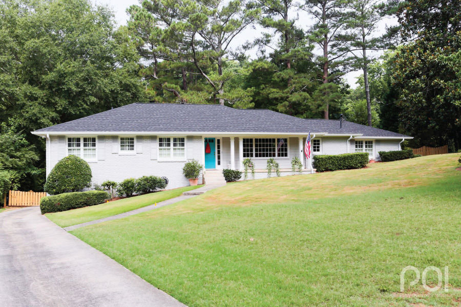
This is Liz’s cozy, comfortable 50’s style Atlanta home and a great example of when a bright, colorful front door works well. Her exterior palette is monochromatic with stark white trim, a light gray body and a slightly darker gray on the shutters. The home desperately cried out for a “look at me” punch. She knew she wanted a form of turquoise on the front door — it was just a matter of finding the perfect hue.
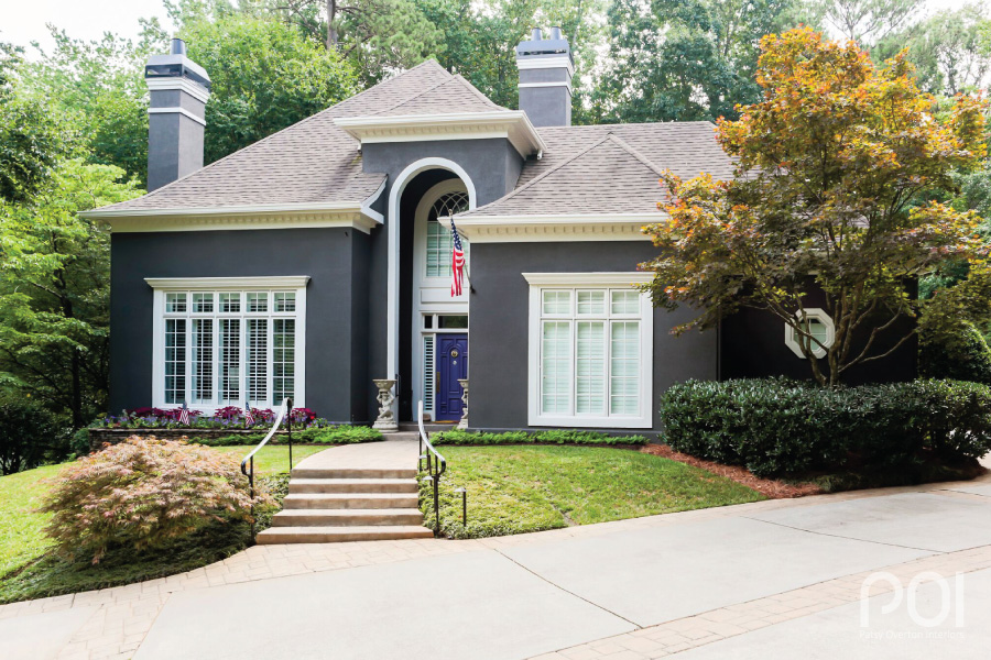
Next is Sylvia’s Atlanta home. When I met with her several years ago she told me she was a retired designer. The interior of this home was painted a dark, rich gray. She wanted to put something similar on the outside. She had selected Iron Ore SW 7069 for the body, but I suggested she tweak the color slightly to Black Fox SW 7020 to play better to the warmer tones in the roof. (There are very few people who would have the guts to put something that dark on their exterior, but she was fearless.) And regarding the front door, she had already selected a deep, rich purple. Something brighter would also have been appropriate for this home, but I think the purple is fabulous since it shows up well against the white trim.
Shown below is another 50’s ranch that was done as a class project in our spring Certified Color Consultant training course. Once we had settled on a nice taupe for the body of the house the homeowner told us, “Every front door up and down the street is a shade of blue/green. I want something different.” The trick here was to find something bright enough to be an accent, but not so bright that it would overtake the subtlety of the taupe. We ended up with Rosedust SW 0025. To see the transformation, take a look here.
And, finally, a blue/green that was the perfect solution in another situation.
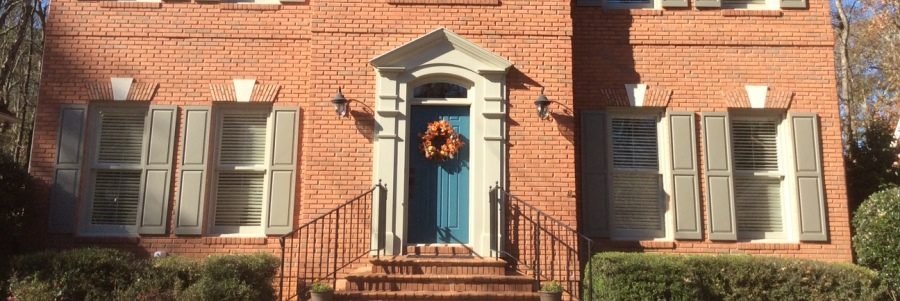
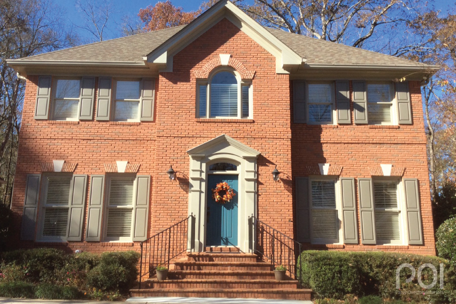
Shown below is Carolyn’s Tucker home. The gray/green hues for trim and shutters were selected because they play well to the deeper tones in the salmon brick, but we needed something more for the front door. I selected Deep Sea Dive SW 7618. Why? Because blue/green is opposite red/orange on the color wheel, meaning they are the perfect complement. Here, something bright would’ve been too much, but the rich Deep Sea Dive was just right. Carolyn told me that a number of people complemented her on her front door color and asked how she found it : )
There are many more front door colors I could show you, but I think you get the idea. Always be mindful of “why” you are selecting one hue over the other. And if you don’t have the confidence to do it yourself, give us a call.
