When you are an Atlanta Color Consultant and specialize in exterior transformations, those frantic calls for help are music to your ears. I received such a call from Cathy.
It was several months ago that she first contacted me so I’ve forgotten her specific words, but the call went something like this: “HELP! I am updating my home and painting the exterior. I’ve been looking at paint color samples for MONTHS, have collected several fan decks and numerous paint strips and have purchased enough sample cans of paint to cover your consultation fee.” (I hear that frequently.) “The more I look, the more confused I become.” (I also hear that frequently.) “I saw on your website that you were trained by Maria Killam who I follow and whose knowledge I trust implicitly. I know you can help me. Will you?” Yes, dear. Just let me put on my cape and I’ll be there shortly. We made an appointment and I was on my way.
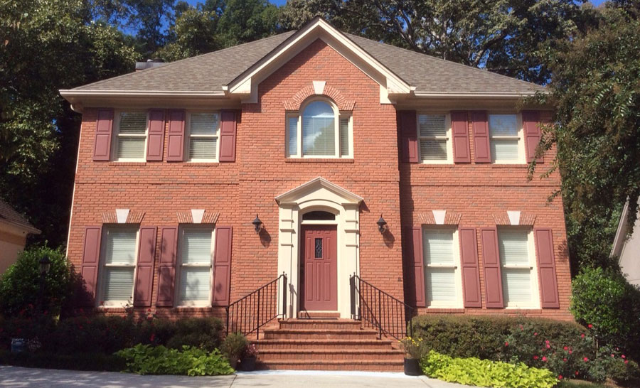
Here is what I saw when I arrived.
BEFORE

So what’s the problem? While this look is not bad and certainly not a color disaster by any stretch, it could definitely look more appealing and eye-catching. What I noticed right away were the nice greenish/gray tones in the brick. They should be played up, as the same tones are in the roof color. When selecting colors for any home’s exterior, the idea is to give a cohesive look by highlighting common tones from the unchanging elements — brick, stone, mortar, roof, etc. In addition, this home is lacking a punch. The muted burgundy hue of the shutters and front door don’t do anything to accent the home, but that’s an easy fix.
So as any professional Atlanta color consultant would do, I whipped out my Sherwin-Williams fan deck and went to work. I narrowed down the choices from the color strips, then pulled out the large paint color samples and held them up against the brick and mortar so that we could take a better look and see clearly what tones would work best. Finally, Cathy and I went “shopping” for a nice accent color for the front door. Here is the palette we arrived at:
- Trim: Intellectual Gray SW 7045
- Shutters: Anonymous SW 7046
- Front Door: Deep Sea Dive SW 7618
Ready for the big reveal?
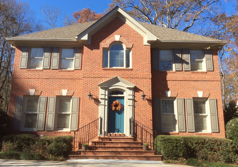
AFTER

Ahhhhh….. See how beautifully the shutter color plays to the deeper tones in the brick and the gray/green in the roof? And how ’bout that Deep Sea Dive on the front door? Love it! Just enough to get the attention of passersby. Here is what Cathy had to say:
I’m sending you a sneak preview of my house with the colors you suggested. It’s a huge improvement over what I had before. Others feel the same way based on the compliments I’ve been getting! I must admit I was skeptical at first and almost called you, but I kept reminding myself that you are inspired by Maria (Killam) and I need to trust your training. Thank you so much for your help!
Cathy and I met again several weeks later for an interior color consultation. The updating process continues, but it all began with painting the exterior to give her home fabulous curb appeal.
I love putting on my cape when I get those desperate calls for help. Who is next?
