Red, yellow, green, blue, orange, etc. What’s there to know, right? Actually there’s a lot to know about the science of color, or what makes certain colors work well together while others do not. Let’s begin with the basics:
- Primary Colors: red, yellow and blue. These are the basic colors which cannot be made from mixing other colors.
- Secondary Colors: orange, green and violet. Each is made by mixing two primary colors together. For instance, red + yellow = orange.
- Tertiary Colors: There are six tertiary colors. They are created by mixing one primary color with an adjacent secondary color. For instance, red + orange = red-orange.
- Warm colors are reds, oranges and yellows. These colors advance.
- Cool colors are greens, blues and violets. These colors recede.
Next, it’s important to know that color is described by three characteristics. They are hue, value and intensity.
- Hue: simply the name of the color, such as red, gold, green, etc.
- Value: the relative lightness or darkness of a color.
- Intensity: the purity of a color, which determines its brightness or dullness. Fully saturated colors are the most intense.
In addition to the color definitions shown above, there are three more terms we must define.
- Tint: color plus white. Tinting a color makes it lighter.
- Tone: color plus gray. Toning a color makes it duller.
- Shade: color plus black. Shading a color makes it darker.
Now that you have an understanding of the basic terminology, I would like to explain the three harmonious color schemes most often used in decorating. They are:
- Monochromatic: using only tints, tones and shades of one color.
- Analogous: using colors that are adjacent to each other on the color wheel. For instance, blue, blue-violet and violet. In an analogous color scheme you would use at least two but no more than five adjacent colors.
- Complementary: using two colors that are directly opposite each other on the color wheel, such as yellow and violet or red and green. It’s interesting to note that complementary colors always pair a warm with a cool color.
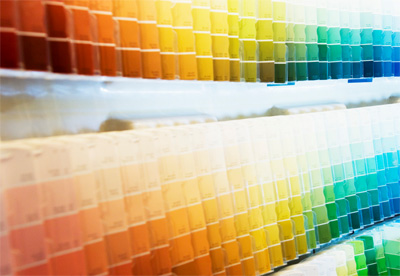
 In the color charts to the left, a monochromatic scheme might use only the colors on the blue strip to the far right. An analogous palette might include (from the left) blue-green, green and yellow- green. A complimentary pairing might consist of green & red or orange & blue.
As you can see, there’s a lot to know about color. We’ve only scratched the surface. If all of this is Greek to you, then it may be time to call in a professional. I am a certified color consultant with two certifications. What do you care about the science of color as long as your have a beautiful home, right? Let me worry about how to get there.
Patsy Overton Interiors... where color never sleeps.

