The minute I stepped into Sylvia’s home last March, I knew I was in for a treat. I saw immediately that the woman had an eye for design and was not afraid of color — my dream client : )
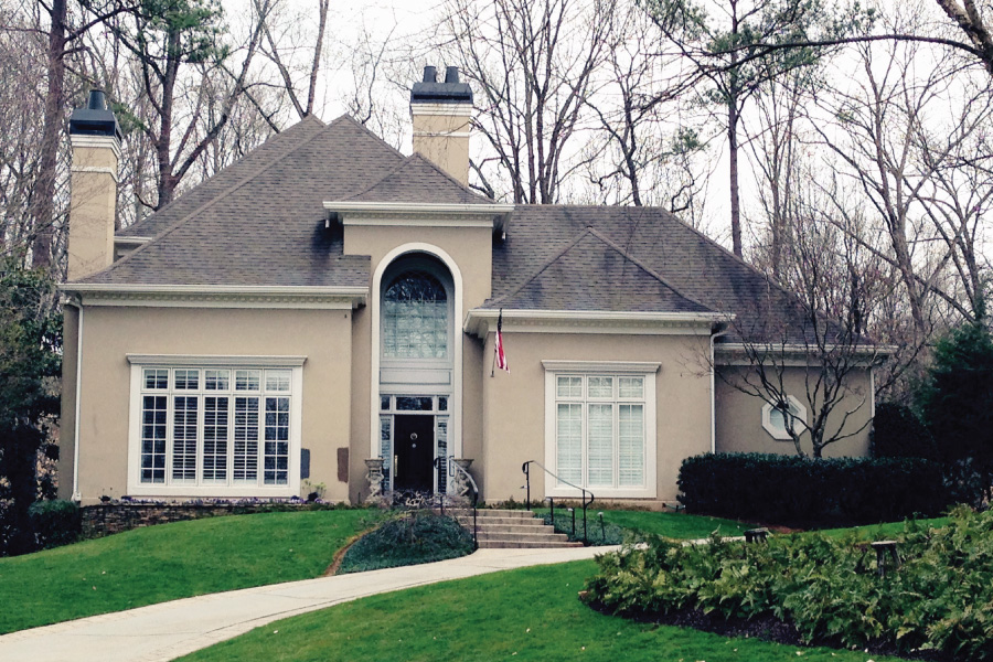
I first noticed that her walls inside were a deep gray. Most people are not daring enough to go with color that rich throughout their home, but Sylvia was up for it. She also had lots of captivating, original artwork. As we began to talk she shared with me that she had worked professionally as a designer with her clients flying her here and there for jobs. (Now why hasn’t anyone ever flown me in for a job? Who wants to be first?) But this post is not about the interior of her home — it’s about the exterior. Here is what I saw when I arrived that day:
Her home was a stately beige stucco sitting atop a hill in a lovely subdivision near Pill Hill. (For those of you who are not from Atlanta, Pill Hill is the area encompassing the campuses of Northside Hospital, St. Joseph’s Hospital and Scottish Rite Children’s Hospital which all sit within a stone’s throw of each other. A little local humor.) When I asked Sylvia what she had in mind for the new exterior look, she told me immediately she wanted a dark gray (how shocking!) and had a specific color in mind. If you will look closely at the photo above, you will see where she has sampled two hues on the house in-between the front door and windows to the left. One is a charcoal gray and the other a brown. She didn’t like the brown.
This would be a good time for me to state that selecting colors for a stucco home can be very difficult. The reason is that there are precious few limiting factors — in this case, only the roof color. While she wanted a charcoal gray, I noticed that her roof had some warm, brown tones. Rather than going with a cold gray with blue undertones like Iron Ore SW7069, I suggested she use a warmer gray, like Black Fox SW7020, to tie the body color to the roof. That is what she did, as it would produce the desired effect without going too brown.
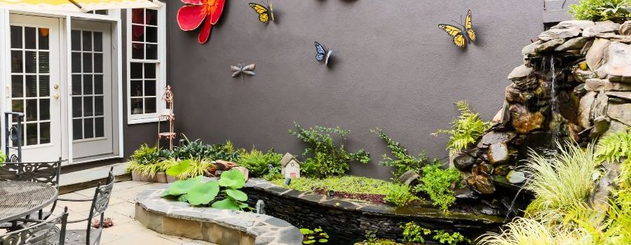
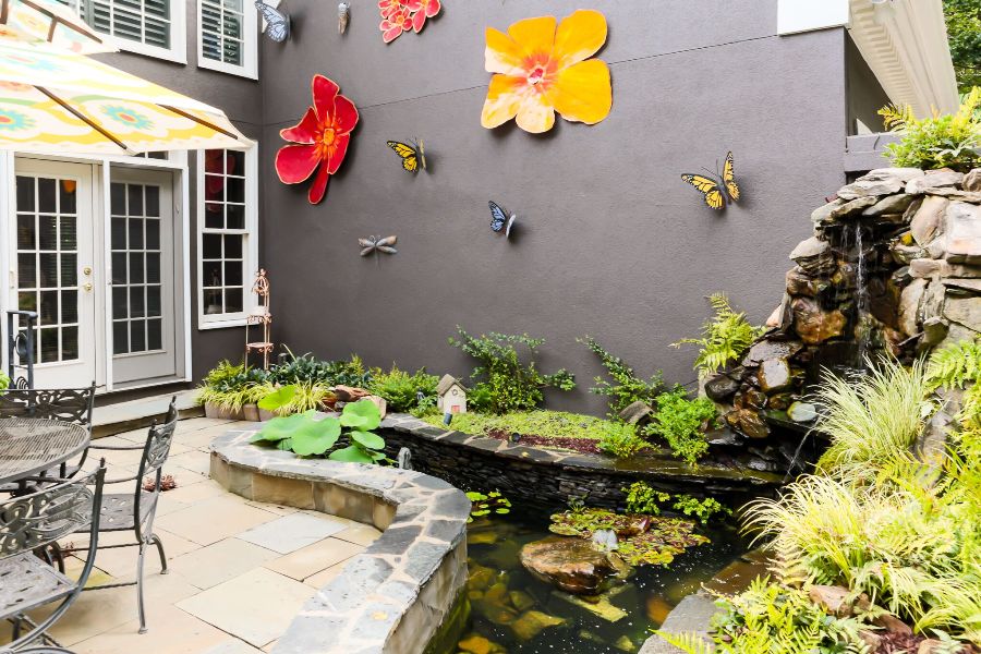
Before I show you the fabulous “after” shot of her home, I must give you a few teasers. First, the lily pond:
Isn’t it lovely with the flowers and butterflies affixed to the side of the house? Also note she has repeated the colors in the umbrella over the table which is one thing that contributes to great design. Colors should never stand alone but should always be repeated. This photo gives you a sense of Sylvia’s wonderful whimsical personality.
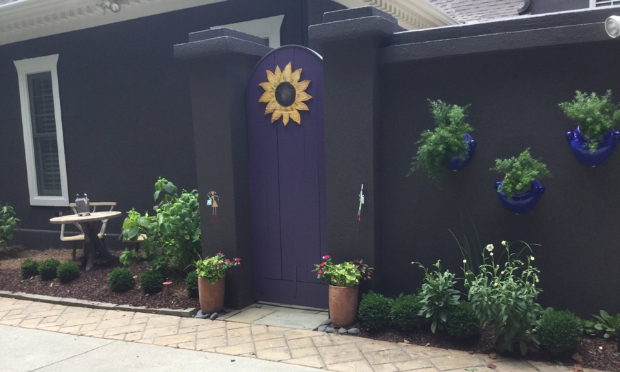
And here is a shot of the side gate:
Notice the hue of the gate in a deep, rich purple. She and I had a bit of a friendly argument over the exact color. She stated it is Mythical SW 6550 while I believe it is closer to Dewberry SW 6552. (Of course, I had to take my fan deck by her home to hold the chart up to her door to check.) The color shown here on the side door is also used on her front door. I love the bright yellow of the sunflower set against the dark purple of the door.
Once again, here is the “before” in beige:
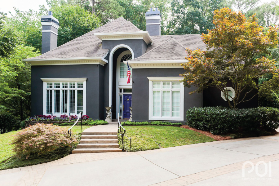
And the dramatic “after” in Black Fox:
Isn’t it beautiful? The Black Fox is the perfect counter punch to the stark white trim. Also, I love that the front door color and the red of the flag are repeated in the flower bed with the Black Fox being the ultimate backdrop. Those things don’t happen by accident, but by careful planning and attention to detail. Take it from Sylvia — going dark can reap stunning rewards, both inside and out.
