Several weeks ago was our last Atlanta 5-Day Training session of 2016. One of the participants was Mallory, my lovely and talented daughter-in-law. I have learned that what she really enjoys in the decorating realm is playing with the “small things.” As the class worked together to redesign the family room, which had a mantle with many bookshelves, I asked Mallory to take photos of each step in the decorating process and write it up in a blog post. The following words and photos are hers.
Last week, I had the wonderful privilege to watch, learn and try my hand at redesign! Patsy’s client Carolyn invited us to redesign her home, meaning we used pieces she already had to revive the space + bring it together. Carolyn had a vast and varied collection of items for us to use, which really made the job very simple. So, if you are someone who thinks you have to go out and buy all new decor to achieve a fresh look in your home, think again. You probably have more to work with than you realize.
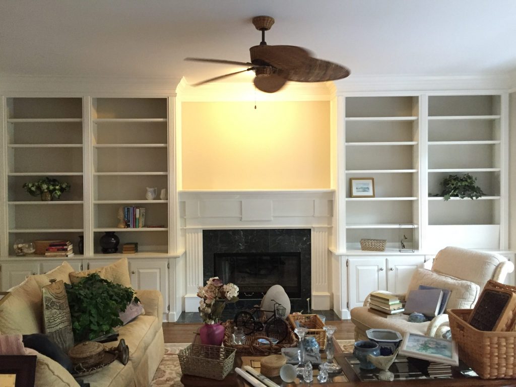
Today I want to show you how we gave new life to just one room: the living room! Here is what it looked like before we touched it:
The living room was lovely with beautiful features, with great potential to be even more inviting. Don’t you agree? The first step: clear the space.
We totally emptied the mantle (and later, the bookcases) so that we could start from scratch — and look at all the props we had to work with! How do you know where to start? Contrary to my natural instinct, the best thing to do is tackle larger spaces first. In this room, we started with the mantle — also the focal point in the room.
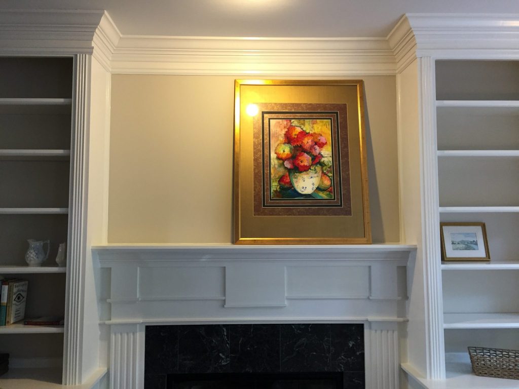
We really liked the parakeet painting, but felt it had a more natural home in the kitchen, where it now hangs! We chose this vivid floral piece to prop above the hearth. Why? The warm colors highlight the subtle warm glow of the (accessible beige..??) on the walls, and not only that, but the prominence of red in the piece catches the eye, and the mantle is definitely the place to put eye-catching pieces! We started with the frame propped in the center, but decided to move it to the right for a more casual look.
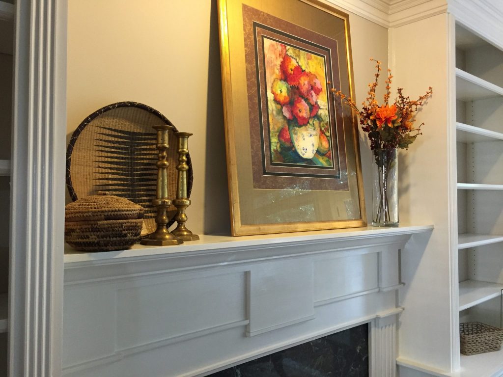
Next, we added some height with the florals in colors that complement the artwork, and added a small cluster of objects to weight the left corner. Notice that the natural tones of the woven baskets + the brass candlesticks complement each other without merging together. A monochromatic can be differentiated by using different textures, just as we did here. We did feel like there was a little too much basket weave going on, though, so we toned it down by removing one.
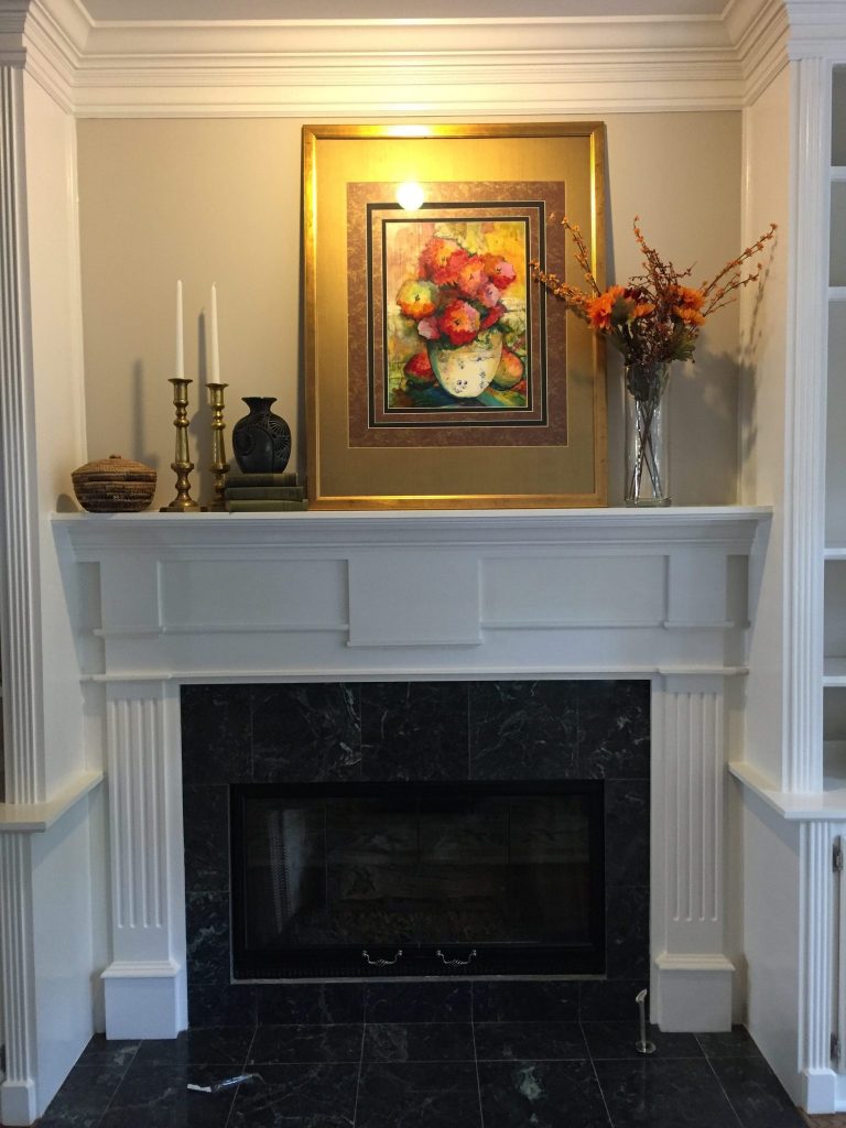
Next, we added some props of a different color, and you’ll notice, a different height. And that’s it! We played around with adding a few other props, but quickly realized that less is more and sometimes you get it right early on in the process. Beware too much fiddling — you could end up messing with something that was good to start with!
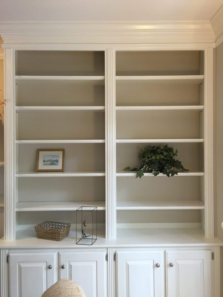
After the larger space was complete, we moved on to the smaller bookshelves. Notice how many shelves there are in this photo. While the smaller shelf space is excellent for housing books, we wanted to create a more dynamic visual display by incorporating some larger props. So…
We simply popped out a few of the shelves, which gave us the space we needed to display some of the larger pieces we wanted to use. You’ll see some beautiful hand-woven baskets tucked away on the left; those were a personal favorite of mine. They added a unique character to the room, and were a reflection of Carolyn’s story.
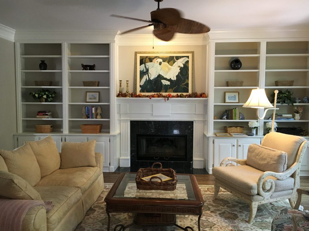
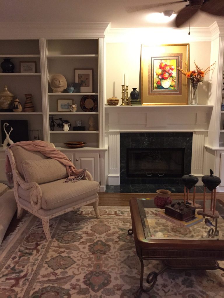
If you’ve been paying attention, you’ll also see — the chair has moved! We knew from the beginning that we wanted to rearrange the furniture in the room, but needed to use up all the props before we could get to it! As we neared the end of the book case installation, we were able to move the furniture around the room. Once again, here is what the room looked like upon our arrival:
And here is the redesigned space:
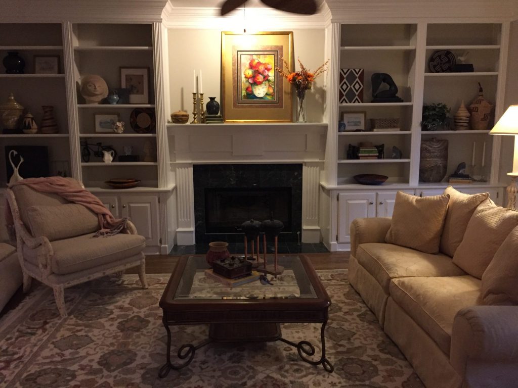
What do you think?! It looks pretty inviting, doesn’t it? The reason we arranged the furniture this way is not immediately apparent in the photo, so I’ll tell you: the foyer is to the left, and so walking into the home, the room opens up to you with the furniture arranged this way. Before, you would walk in to see the back of the couch! Certainly not the “wrong” place to put the couch, but this way it is more inviting and accessible.
You also might’ve noticed that the room is darker. (Yes, we were losing daylight.) These things do take time! All in a day’s work.
I want to show you one other thing, and that is how we transformed the room immediately adjacent to the living room. I mention this because:
- We remembered to take both before + after photos to show you! Sometimes redesign is so exciting you can forget to take a before shot. Oops.
- Always consider the other rooms that you can see from the room that you are decorating. Though they are separate rooms, there is some continuity not to be ignored.
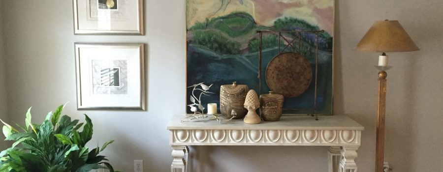
Here is what it looked like before:
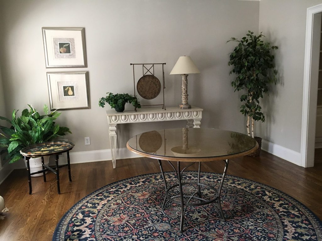
And, here is what it looked like after!
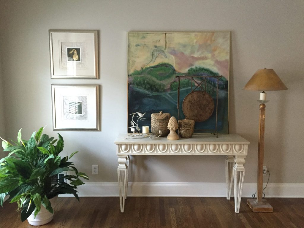
We immediately loved the standing gong, but wanted to root and fill the space a bit more. Carolyn delivered once again, as she had this gorgeous piece we were able to prop on the table. Note: I think these were the only two pieces we elected to prop rather than hang! We sure did hang a lot of pieces elsewhere in the house, so this is not a suggestion to only prop your artwork. Though it does work in some cases, such as these two I’ve shown you!
Thank you for walking with me through this redesign tour! I hope this leaves you feeling empowered that you can work with what you already have in your home. And if not, just call us + we’ll do it for you 🙂
Thank you, Mallory. Love the sales pitch at the end! Yes, friends, we are here for you.
I will leave you with this testimonial I received a few days later from Carolyn.
“I want to thank you for the work you and your team did in my home. I couldn’t have asked for a better experience or outcome! You magically transformed the bare walls, tables and bookcases into a stunningly beautiful home that I enjoy every day. Personally, I gained a greater sense of appreciation of the hard work and skill that goes into home styling. I am still in awe of the artistic beauty that surrounds me now. You definitely raised the bar. I couldn’t have done it without you!”
Carolyn, it was our pleasure! Who is next?