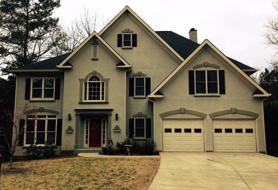
Have you ever considered painting your home red? I didn’t think so. This customer did. When I arrived at Manderly’s home in February for an exterior paint color consultation she said, “Patsy, I am painting my house red.” Here is what I saw when I arrived that day:
 Actually, this is a very nice home and had a much better look than what you see in this photo. The sky was overcast that day which is why the neutral colors look very blah. Nonetheless, the homeowner was ready for a BIG change.
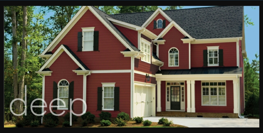
Once I picked myself up off the floor after Manderly told me she was going red, I asked why. She explained that she would’ve gone with some form of gray, but that’s what her neighbors had so that was out. She then did an all-out search online for paint color options for exteriors. She found a beautiful red home on the Pratt & Lambert website and fell in love with it. After searching further, she couldn’t find anything else she liked better. Here it is:
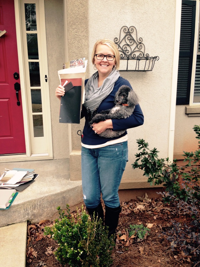
How fabulous is that??? I must stop and tell you that, having worked as an Atlanta paint color consultant for going on six years now, I have worked with homeowners twice before who were painting their homes red. One was a cedar siding home in an older neighborhood in East Cobb; the other was a totally traditional two-story home in a traditional neighborhood in Suwanee, much like Manderly’s in Woodstock. I distinctly remember having a conversation with the Suwanee homeowner that day while we were looking for the right shade of red. I mentioned, “You know, you might have a hard time getting this past the HOA.” She looked at me with a smile on her face and said, “That won’t be a problem. I’m the president.” The woman knew how to play her cards. But, back to Manderly, she told me right off that she had already gotten permission to paint her stucco home red, and she is not the president of her HOA. I admit I was surprised. Here she is holding her doggie and her new color palette:
We worked hard that morning to color match her Pratt & Lambert colors to Sherwin-Williams; but, in the end, she decided to stick with P&L. Here is her palette:
- Body – Manchester Red 4-17
- Trim – Downy Gray 8-32
- Accents – Obsidian 33-17
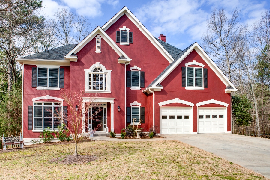
Ok, are you ready to see the “before” (once again) and “after”? Get ready for a jaw dropping experience.
Is that an incredible makeover, or what? And I can’t take an ounce of credit for it. Manderly knew exactly what she wanted before I arrived that day. When I asked why I was there she replied, “for moral support.” Somehow, I don’t think she needed it. Congratulations, Manderly, on a beautiful job! If you ever get tired of teaching…


