Today we are going to take a look at painted brick, painted stucco and painted siding. Three of these homes were transformed this year while one was done in 2016.
First, let’s look at painted brick, which is still running full speed in Atlanta.
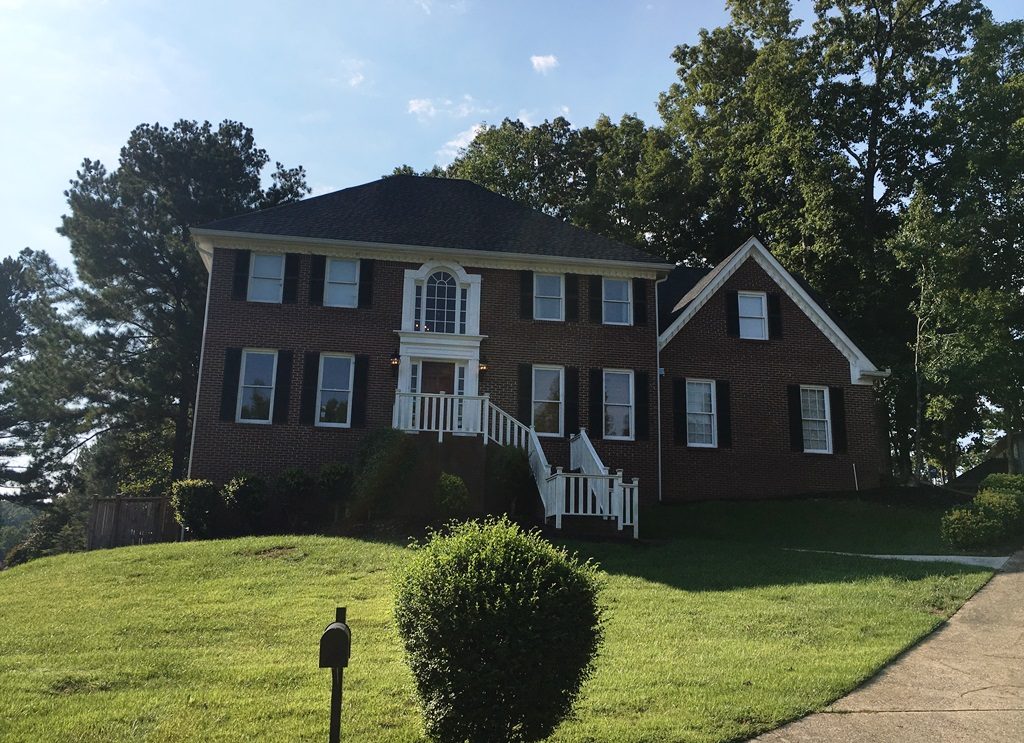
Britton first called me in 2017 to help with interior colors. Evidently she was pleased, so she had me come back in April of this year to help her select exterior colors. Here is her house as I saw it that day.
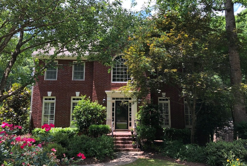 This is your basic two-story traditional red brick in Roswell. Britton was interested in painting the brick, but wasn’t sure they were going to. As I told her that day, if she didn’t paint the brick her house would look pretty much the same afterwards no matter what color she chose for the trim; however, if she did paint the brick, she would end up with a new house. (That’s my sales pitch to anyone considering painting the brick.) We came up with two different color palettes — one if she painted the brick and one if she didn’t — but I was delighted to find out she had painted it.
Are you wondering why we needed two separate palettes? Thank you for asking. If she was not going to paint the brick, then we needed to make sure the colors we were using played well to the brick. In other words, we were limited by the brick. The red brick would’ve been our largest “fixed” element that we could not ignore. On the other hand, if she was going to paint the brick, our only limitation was the roof color which had warm tones. We were careful to tie that in with the hues of the trim.
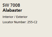
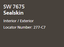
Britton loved the look of white painted brick, as it is still totally on trend today. After looking at her neighbors’ homes to make sure we weren’t going to copy anything close by, we decided on Alabaster, which is a soft white. Here is her full color palette:
Brick – Alabaster
Gutters & Downspouts – Sealskin
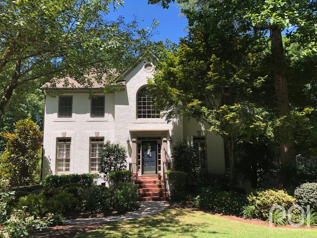
And the beautiful after shot…
Here you can see the warm tones in the roof that we tied to the trim color. And notice how Britton had the triangles above the windows painted the trim color rather than Alabaster. I thought that was a nice touch. Also, she left the bricks on the steps and landing natural to tie in with the landscape. I see it done both ways. Either is nice — it’s just personal preference.
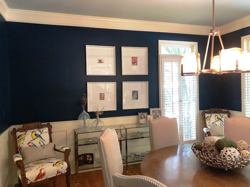
One more thing before we leave Britton’s home. When I was there for the exterior she asked for my help with a color for the dining room. We decided on one of my favorite Sherwin-Williams hues — Moscow Midnight. It is a very deep, rich blue with a bit of green. I want to paint my powder room cabinets that color, but haven’t gotten around to it. She also used a light blue/green on the ceiling — Rainwashed SW 6211. Feast your eyes…
We were working from the blue in the chair fabric for the wall color. I think they play together very well. Also, I applaud Britton for the way she has framed her photographs displayed on the wall — another hot, “on trend” look for today. Well done, Britton!
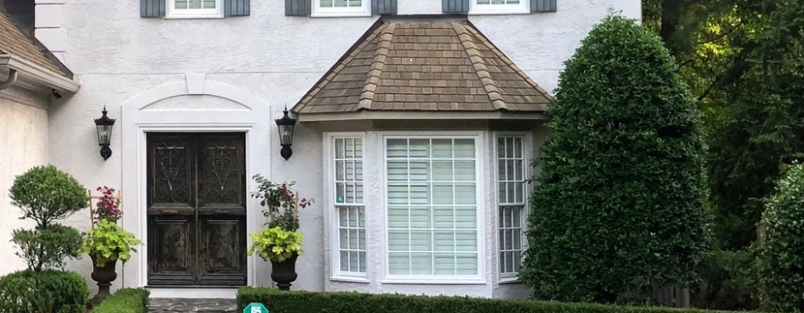
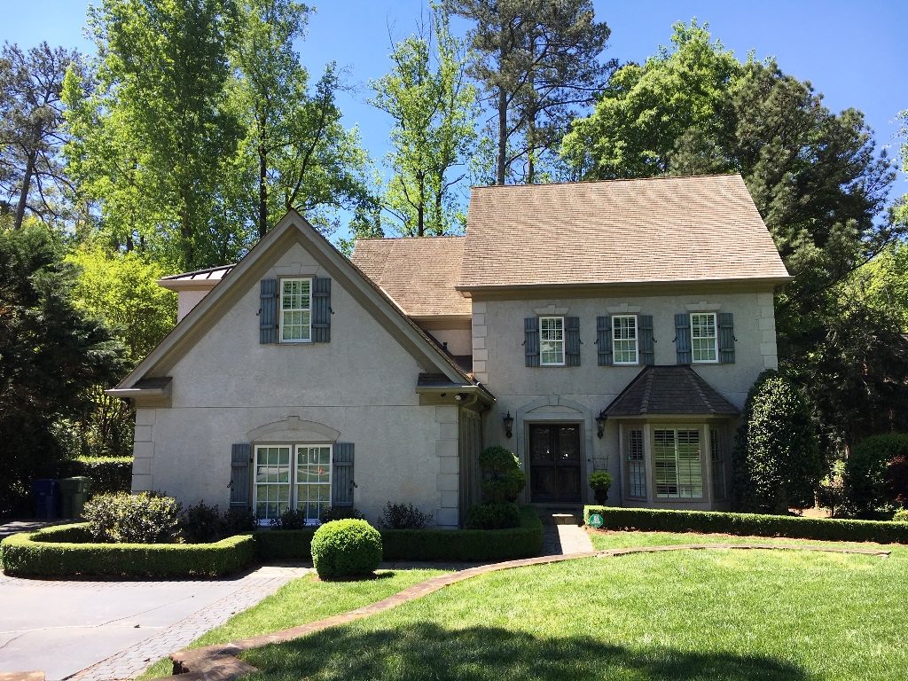
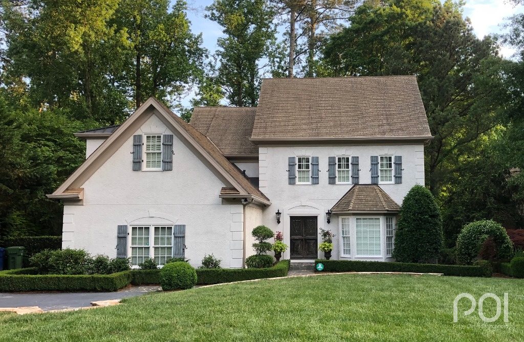
Next, I want you to see a beautiful “old world” stucco home in Atlanta. I saw Lynn within a week after assisting Britton. Here is her “before” shot:
It’s hard to get a good read on the house from this picture, as the sun was not shining on the front of the house but just on the roof. It was actually much prettier to begin with than it looks here. Lynn wanted to “lighten and brighten” the home without going to a strong white. She wanted the stucco body and accents all painted the same color as the body of the house. Also, there were two things she was not going to touch — the blue shutters and the stained front door. Both elements were faux painted to give them an aged looked. (You will get a better look in the “after” below.) Another thing to keep in mind was the white windows. They were not to be painted, so we wanted/needed them to blend better with the house.
We decided on the following palette:
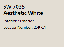
Stucco body & accents, window & door facings: Aesthetic White
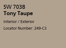
Trim: Tony Taupe
Shown below is the beautiful after. This is one of those cases of minimal change that packs a powerful punch. The body is similar to the original, only lighter, and the trim is close to what she had, only it shows up better now that there is more contract to the stucco hue. Also, please take note of the fabulous shutters and front door colors which were not clearly visible in the first photo.
Lynn said, “We received so many compliments at my daughter’s baby shower. It truly is amazing how paint can totally transform a space.” I couldn’t agree more.
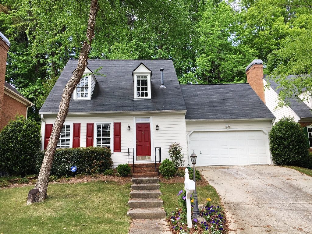
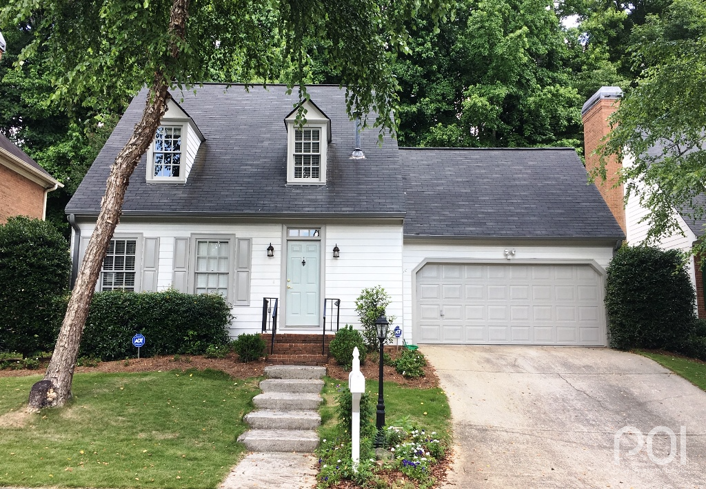
Next, a cottage in Decatur. Cynthia, who had just gotten back from the Masters when I saw her this spring, needed a little help inside with the master bath, which she was remodeling, but we quickly moved outside to see what we could do to give her home a facelift. Here is the before shot.
In this case, the only fixed element we had to work around was the roof. Unfortunately, that didn’t help much, as you can use either warm or cool colors with a charcoal gray roof. But Cynthia knew she wanted a change and something fresh. After looking at a number of options, we decided on a white body with gray trim. You can’t see it very well in the above photo, but the home was initially a light shade of yellow, so white would be more up-to-date. As with Britton’s home, we used Alabaster for the body (white, but not too bright) and Mindful Gray for the trim. Here is her palette:
Body: Alabaster
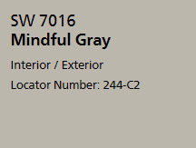
Trim, Garage Doors & Shutters: Mindful Gray
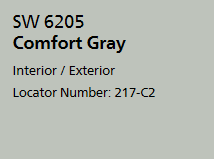
Front Door: Comfort Gray
In addition, Cynthia went with a deeper gray on the gutters and downspouts to tie in the roof. Here is the “after” shot:
Seeing this makes me smile. It’s so much more “cottagy” with the lighter body and darker trim. Also, having less contrast between the body and accent colors gives the home a cozier feel. In addition, I want to point out that having shutters and trim the same color is another trendy look today. I see this frequently when I drive through Buckhead.
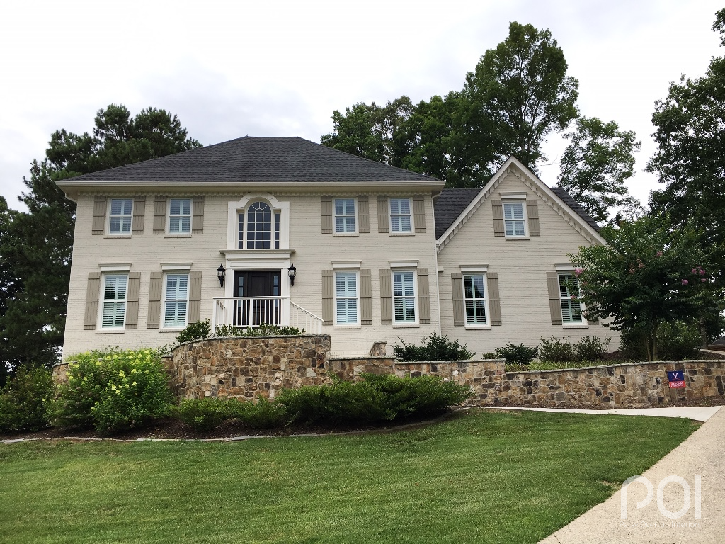
Finally, I had a bit of a surprise several weeks ago. A funny thing happened on the way to my Roswell color consultation. As I was driving through the subdivision looking for a house number, I glanced over to my left and recognized a home I was consulted on several years ago. Here is what it looked like in September of 2016:
Yes, another two-story traditional red brick similar in some respects to the first one on this blog post. Michelle had called me for a color consultation on the exterior as they were going to be doing a good bit of renovating, front and back, and wanted to make sure they got it right. (Actually, now that I think about it, she was also doing LOTS of renovating on the interior where we walked through a war zone. It looked like something out of Love It Or List It with the kitchen fully torn up and a hole in the ceiling where you could see clearly through to the 2nd level.) We worked hard to find a pleasing palette that would complement the substantial stone work that had already been done to the large patio with grilling area and a fire pit — several levels — out back.
When I saw and recognized the house a few weeks (months?) ago, I realized I never received “after” shots from Michelle once the work was completed. I understand. It seems that a good many of you have better things to do than take photos of your home for my website : ) It’s ok. I get it. But that day, seeing the thrilling results, I had to pull over to the side of the road, jump out of the car and swing into full photographer mode. Here is the “after”:
I’m so very pleased with the way this home turned out, and I applaud Michelle for having the vision for the stone wall, which absolutely shows off the color palette in its best possible light. On this particular job, our starting point was the stone which had already been laid out back. We knew the taupe family was what was called for. Our palette was the following:
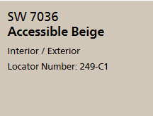
Body: Accessible Beige
Trim: Aesthetic White
Shutters: Tony Taupe
I think it’s very interesting that three of the four homes in this post are done in shades of taupe with very different results. The first home has a white body with taupe trim. The second home has an off-white body with taupe trim. The third home has cooler grays while the fourth home has a light taupe body with deeper taupe tones on trim and accents. In case you were wondering, taupe and greige are the “sweet spot” for today’s colors. They are right in between cool and warm. But even the cottage home that was done in grays is in warm grays, which are still very much on trend. I would encourage you to stay away from cool tones (those hues with a blue undertone) and head back toward warm.
People ask me sometimes if I can guarantee that their color palette will still be on trend in 5-7 years. I always answer quite honestly, “No.” Do you know why? Color palettes are constantly changing, along with fabrics, tiles, accents, etc. If they weren’t, then we wouldn’t have to be out there spending money every day to stay current, would we? Marketing is all about presenting what’s new, which makes us dissatisfied with whatever we currently have. The name of the game is to keep us out there shopping. My advice to you is don’t get caught up in the trends. Use what you like in your home and you will always be happy.
