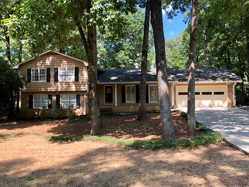
Last summer I received a call from Gretchen who said her Dunwoody home needed a facelift. It seems she and her husband, Reed, were doing extensive renovations on the interior — knocked down walls, opened up the living room/kitchen, new counters, cabinets, backsplash, etc. — and decided the exterior was going to look out of place. (Note: they were absolutely right! It is always best to have a smooth transition exterior to interior if you can afford to update both.) I was pleased to be called on to help with a new exterior color palette. Here is what I saw when I arrived:
What can I say? Inside they were going with a modern, clean-lined white kitchen — everyone’s dream kitchen in 2019; but the outside didn’t have quite the same vibe. It was stuck in yester-year with it’s peachy brown painted siding and brick. A lovely, cozy home for sure, but not the look they wanted to present to their neighbors.
I recall there was some discussion initially as to whether or not to paint the brick. You have to look closely to see it in the photo above, as it was a perfect blend to the siding color; but I told Gretchen and Reed the same thing I tell all of my clients which is this: if you don’t paint the brick, you are bound by the brick and will end up with pretty much the same look. The siding could be lighter or darker, but still must work well with the existing brick. On the other hand, if you do paint the brick, you can head out in a new direction and completely transform your home.
They quickly caught my drift. We proceeded to investigate a new color palette.
They wanted to stay with a light, white trim. That was a given. Then Gretchen told me she liked the soft grays for the home. I knew exactly what she wanted.
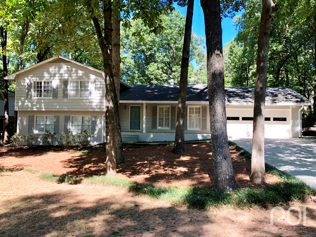
In the end, we went with a warm, gray palette of Mindful Gray SW 7016 for the brick and siding, Aesthetic White SW 7035 for the trim, Acier SW 9170 for the shutters and front steps and Refuge SW 6228 for the front door. (Note: it would’ve also been appropriate to paint the front steps Mindful Gray to match the body of the house.)
Several months later Gretchen sent me a few “after” pictures. Take a look:
How pretty is that? Gretchen and Reed have a new house! Bye, bye peachy brown. Hello soft, warm grays.
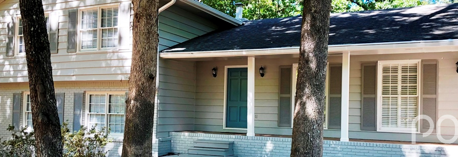
FYI, what you see in this photo with low contrast between body color and accent colors on the shutters is totally on trend today. I’ve even seen homes and specified colors for less contrast than this, but, either way, the tone-on-tone is beautiful, calming and current.
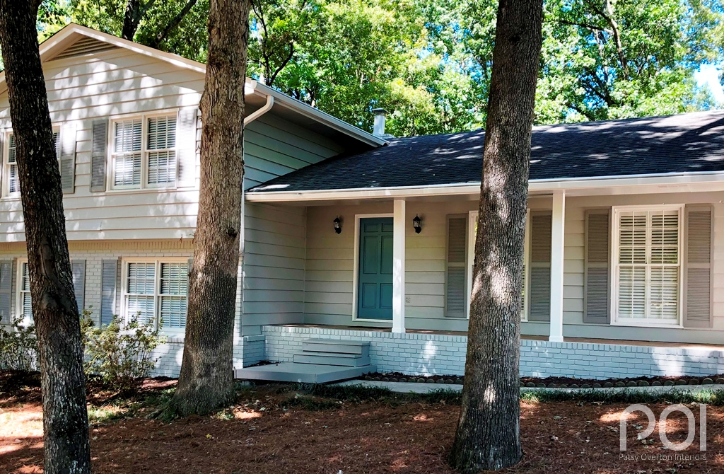
Here is a closer shot of the front door color — Refuge SW 6228:
This pretty, blue/green is warm enough to play well to the gray on the body. Don’t make the mistake of going too cool with the front door color when you are using grays on the brick and siding.
I want to thank Gretchen and Reed for sending the photos and letting me share their beautiful transformation with you.
Does your home need a facelift? I’m only a phone call away. 770-843-2307


