When Carol called for help with her lake cottage, I was ready to go.
I’ve been working with Carol for 4-5 years. When she first contacted me it was for color/staging help with her Alpharetta home, which she and her husband were about to put on the market. (An interesting side note: her Alpharetta neighbor was one of the Back Street Boys! I diligently looked for him the day I was there, but to no avail. All that wrought iron railing was quite a deterrent.) When I first met her, Carol and her husband already owned a lake home. The plan was to sell the Alpharetta home and move to the lake permanently.
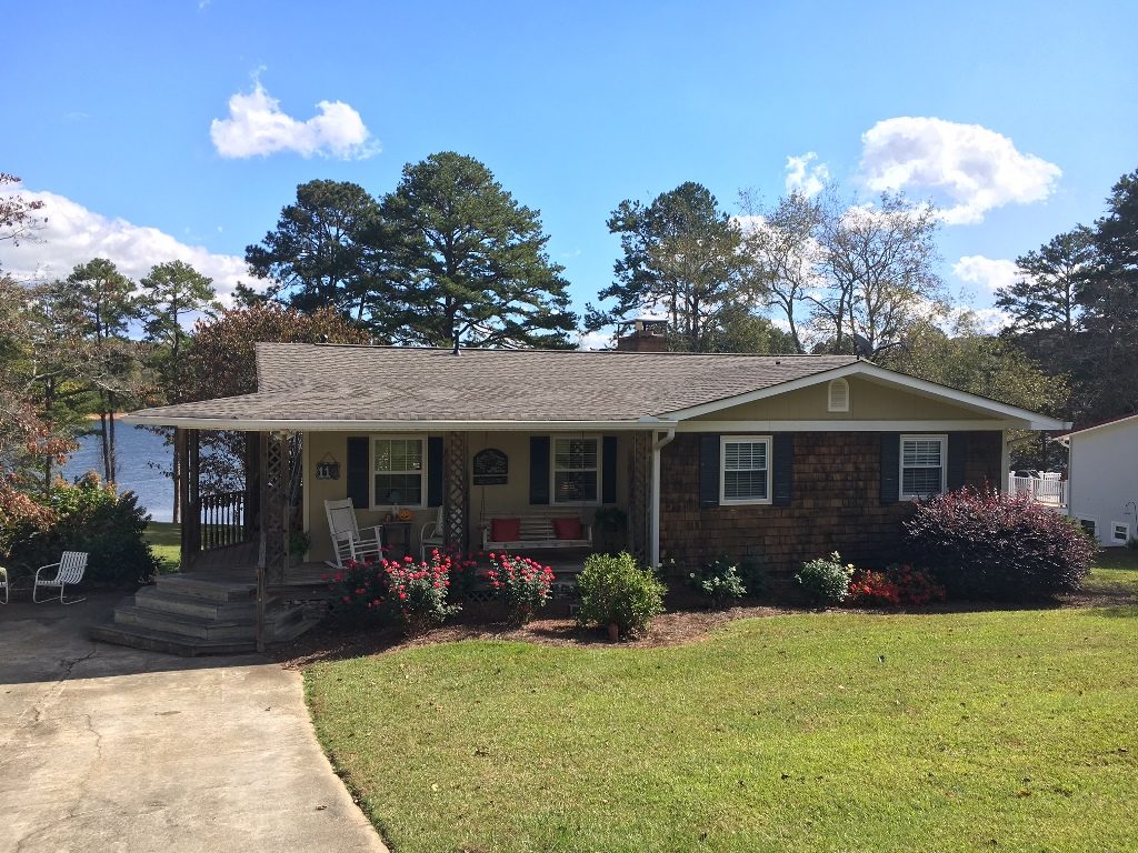
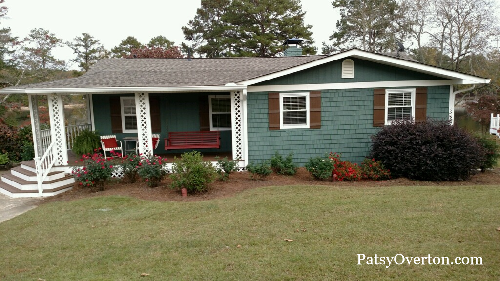
Fast forward to the fall of 2017. Carol called to say that she needed to update the lake cottage with exterior painting and needed help selecting the colors. Here is what it looked like when I arrived.
The lake home is adorable. It’s much larger than it looks, as it is built out on the backside toward the lake. When I asked what she had in mind for the exterior, she deferred to me. Hmmm……. Here is how I proceeded to come up with a color palette.
First, I noted that the house with its painted siding, stained cedar shakes and stained front porch looked very disjointed. I felt that the body of the house should be all one color and the porch railings and lattices should be painted to match the trim. Carol concurred.
Second, we determined the trim should be a strong white very similar to what was already on the home. Why? Because the windows were white vinyl and not to be painted. Since the house was already trimmed in white, we simply added the porch elements.
Next, we moved on to the body, which included siding and shakes. With nothing but white trim to work around, our color options were wide open. I liked the idea of something in the blue/green family and Carol was on board. We both thought that color would make a nice back-drop to her pretty, rose pink flowers in the front. We looked at several different blue/green hues and finally made a decision.
Finally, there were the accent colors for the shutters and front door, which is actually on the side of the house and not visible from the street. She was getting a new roof with brown tones, so I knew the shutter color should tie in the roof. We went with a dark brown.
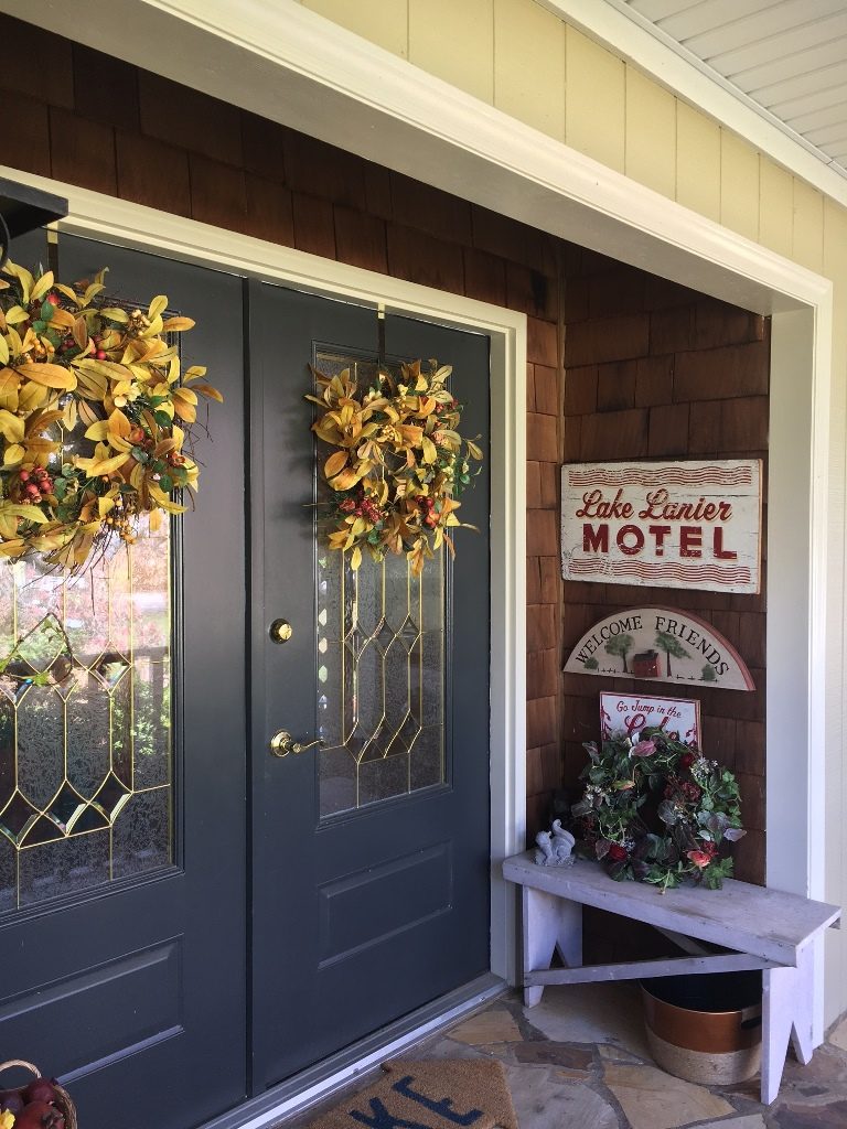
As for the front door, it’s such a shame that it isn’t seen from the street. How cute is this?
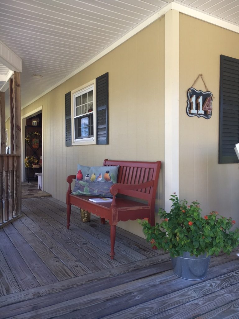
PLEASE NOTE: The following two photos have been flipped and saved to upright. When viewed on my computer, they come out upright; but when viewed on a smart phone or iPad, they come out sideways. So sorry. I am aware of the problem. If you have a solution, please contact me via the contact form on my website. Thank you!
We came to a decision for the door color based on other accents Carol already had on the front porch.
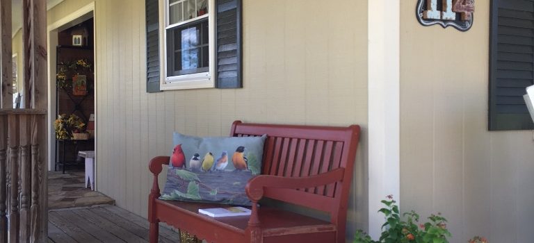
She and I both loved her red bench and decided to stay with a color very similar for the front/side door, which is actually down from the bench on the right in the recessed area. Also, this photo gives an accurate impression of the deck and railings, which needed to be incorporated into the color scheme. We selected a solid deck stain color, then color matched it to a brown for the shutters.
In the end, here is the color palette we decided on that day:
- Body: Rocky River, SW 6215
- Trim: Extra White, SW 7006
- Front Door: Rustic Red, SW 7595
- Deck: Buckthorn, SW 3003 (solid stain)
- Shutters: paint color match to Buckthorn
Once again, here is the “before” picture:
And the freshly painted “after”:
Carol was very pleased with the outcome of the freshly painted cottage saying, “I can’t get over how much bigger the house looks.” That was accomplished by unifying the paint colors on body, trim and porch elements. I wish I had a good photo of the front/side door to show you, but don’t. So sorry. It ties in beautifully with the pillows, swing and bench on the porch. You’ll have to take my word for it this time.
Thank you, Carol, for allowing me to showcase your home on my website. I’m hoping you never run out of projects with which you need my help!
