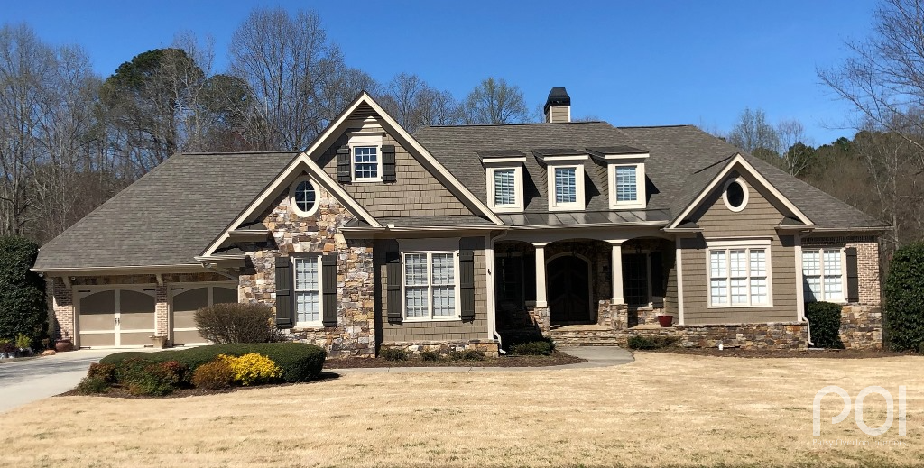
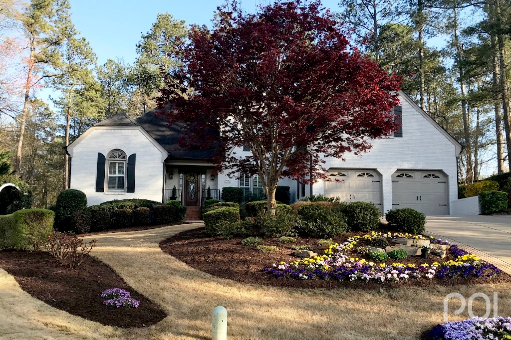
I always enjoy sharing recent Atlanta exterior transformations I’ve had the pleasure of being a part of.
When I was first trained in color in 2010, the class was all about interiors — how to put together a color palette, how to create flow from room to room, how to match paint color to fabric, etc. What an absolute SHOCK it was when my first jobs were for help with exterior painting! I had to learn on the fly. Hopefully, I didn’t ruin too many homes.
But now it’s 2019 and I’ve helped with numerous Atlanta exterior transformations. Here are some recent before & afters.
First, let’s take a look at Mary’s Roswell home. For some reason I didn’t take a “before” shot when I met with her for the consultation, so shown below is the only one she had on hand.
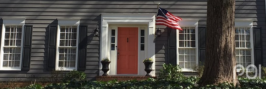
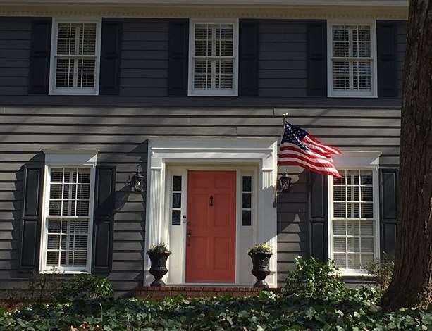
Mary didn’t have anything in particular in mind when we met last fall, but she and I both wanted her home to have a more distinct look. I suggested a deeper body with light trim and a fun, updated front door color. The body color we chose was Gauntlet Gray SW 7019 and Rejuvinate SW 6620 for the front door. Here is a picture I took and cropped to match her “before”:
And the full view…
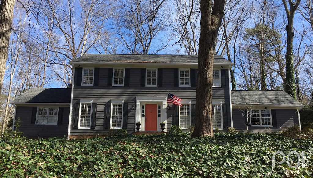 Mary has a new house! She and I both love that it now makes a bold statement rather than fading into the landscape. And what do you think of the front door color? It’s always a good look to play a bold color in warm tones of red, orange or yellow against dark, cool tones. This orange front door commands attention, don’t you think?
Next, let’s take a look at Vanessa’s Bethlehem home. (That’s Bethlehem, GA for those who are not in the area. I’ve not yet been called on for an exterior color consultation in Israel, but I’m always hopeful.)
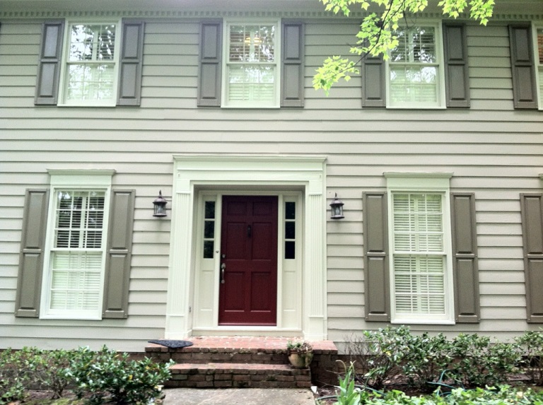
Vanessa and I met for a color consultation in December of 2018, but she called me back in February of this year to take another look. Here is what the house looked like before being painted:
On our first visit in December we had tweaked the color palette, but she still wanted to stay with a darker trim and lighter body. When I went back this year she had decided to do the reverse of that with lighter trim and darker body. The trick was to lighten the trim without going too far. We spent a good bit of time looking at several different values of taupe, but ended up using Balanced Beige SW 7037 for the trim and Virtual Taupe SW 7039 for the body. Here is the end result:
I just got off the phone with Vanessa to double check her colors before posting them here. She told me a neighbor stopped by after the house had been painted. He said, “When we first saw the light trim going up we thought ‘uh oh’, but once it was up, we thought it looked ‘freakin’ awesome!'” These colors stay true to the architectural elements of the home, yet give it an update with the lighter trim. Well done, Vanessa!
On a side note, have you noticed that I’ve said several times “we” when referring to final decisions on color? It is not my job as a professional color consultant to go in and dictate hues, but to guide my clients in the direction they want to take while preventing them from making mistakes in the process. If you would like to know more about how it works, take a look here.
Finally, you know I can’t write a blog post on Atlanta exterior transformations without including a painted brick, right?
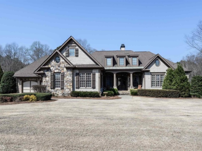
It was less than a month ago that I met with Joan and Larry in their Marietta home. Jose’s Painting was ready to go, but they needed paint colors. Here is what the house looked like when I met with Joan & Larry:
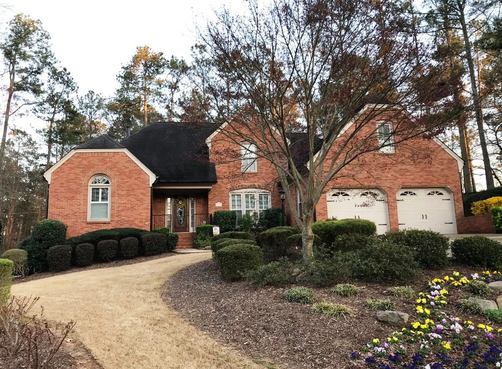 When I asked Joan what she had in mind for the house, she replied, “There is a painted brick near here that I love. Could we drive down there so I can show you?” Of course! I actually do that frequently with clients. Sometimes we will look at photos online, but when there is a look they love that is close by, we will frequently drive by.
When we pulled up to the home, I walked up to the front door and rang the bell. When the homeowner opened the door, I told her who we were and what we were doing. She had no problem with it whatsoever, but said the house had already been painted when they bought it and she had no idea of the color. I quickly did a color match and gave her the hue. She was delighted. No charge : )
Joan and I went back to her home where we needed to come up with a trim color. Since they had a very dark roof, already had black gutters and downspouts and were going to put up black shutters, I thought we needed an in between/transitional color for the trim and garage doors. After looking at a number of options, we decided on Keystone Gray SW 7504 for the trim to go with our Agreeable Gray SW 7029 on the body. Ready to see an amazing painted brick transformation?
How pretty is that? Of course, the beautiful landscaping with blooming flowers and trees certainly adds to the overall look. I still cannot get over how painting the brick will completely transform a home and always admire clients who have that “go for it” mentality.
Thanks to Mary, Vanessa, Joan and Larry for sharing their photos. Yes, each of them was very patient with me while I had them go back out a time or two to get a better shot : ) I hope they appreciate that it’s all about showing their beautiful homes in the best possible light.
If you are struggling with exterior colors, I can help. 770-843-2307 or Patsy@PatsyOverton.com
Want to see more Atlanta exterior transformations? Go here.
