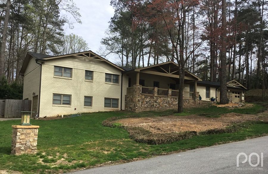
I never tire of remarkable exterior transformations, and this one is a doozie.
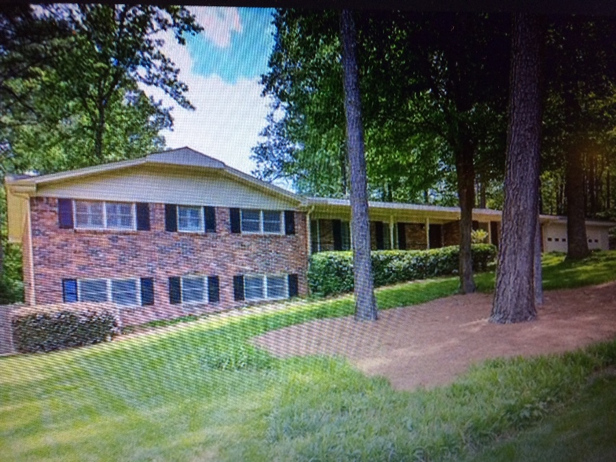
It was back in January that I met Chip and Tim. I was there to provide a paint color consultation for their upcoming work with their painting company. Unfortunately, I don’t have a photo of what the house looked like when I was there that day. As I recall, ice and snow covered the ground from a recent Atlanta snow storm, so we spent as little time as possible outside. Shown below is a “before” shot Chip sent me afterwards of the house in its original state when they purchased it. (I believe this was the real estate photo.) When I was there, they had already made considerable structural changes. The last piece of the renovation puzzle was to have the house painted.
We went inside for a preliminary discussion of what they had in mind for the house. I found out that Chip creates beautiful stained glass, was accustomed to working with color, and had picked up a few paint chips to show me for the exterior. What he wanted was warm neutrals for the house. Unfortunately, the paint chips he had selected had a red undertone. I looked at him and said, “You know you will have a pink house using this paint color, right?” He was a bit surprised to hear that. We went outside where colors read completely different in the light of day than they do inside in artificial light. I found a similar color to what he had selected, pulled out the large color sample (8 1/2 x 11″) and held it up against the beautiful new golden flagstone on the front porch. He gasped when he saw how pinkish it read against the yellow.
We got to work and found similar warm neutrals with a yellow/green undertone which would play well to the stone. We decided on Softer Tan SW6141 for the body of the house and Dapper Tan SW6144 for the trim.
Chip sent me an email after I had left that day saying, “You saved us from making a very expensive mistake today!!! I’m familiar with the color wheel, but not as it pertains to more muted/natural tones. Thank you, Thank you, Thank you! I can’t wait to see the colors we picked out on the house! I will send before/after pictures.” How nice. Thank you, Chip! The pleasure was all mine.
But there was more…
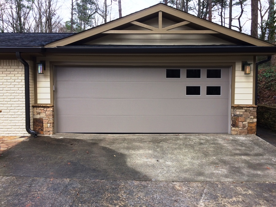
Several weeks later I received a text from Chip stating that he and Tim were not happy with the garage door color they had selected. (See below.) He wanted to know if they should paint it the house color or the trim color.
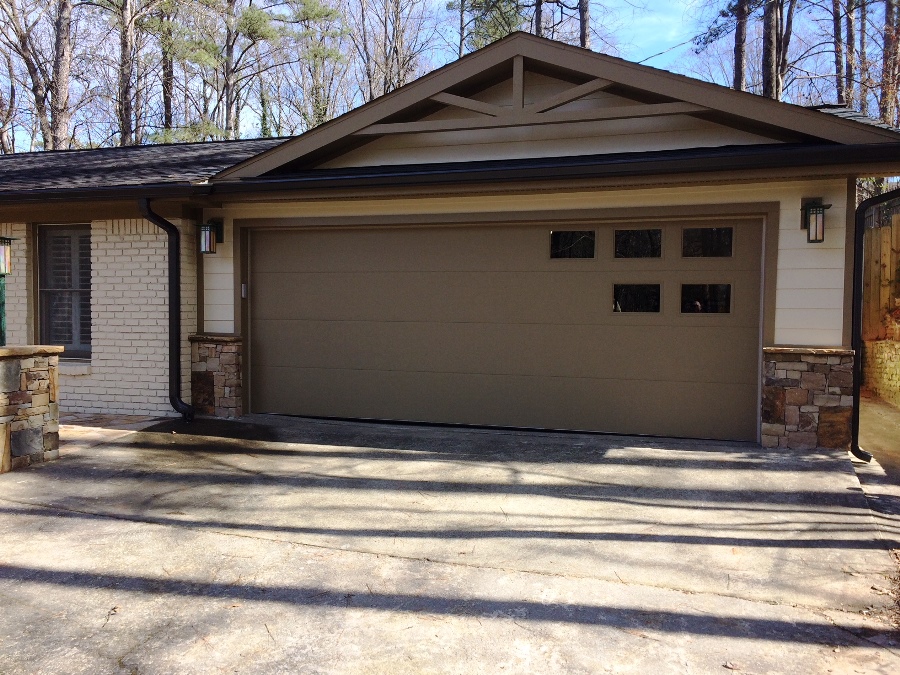
If I may use this as a teaching tool, the color wasn’t working because this particular gray doesn’t relate well to the warmth of the stone and the new body and trim colors. It reads very purple here. But once they had it painted the trim color…
…all was in harmony.
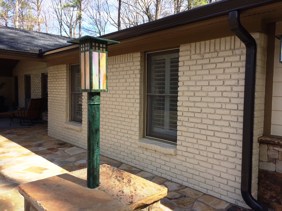
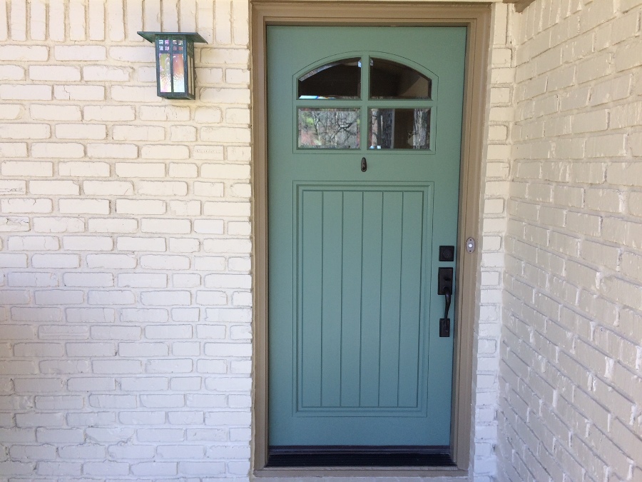
Then there was the matter of the front door. Chip and Tim had bought these fun blueish/green lantern style lights — three or four. Since they were interested in a colorful front door, I suggested we tie it to the hue of the lanterns.
We looked at several variations of blue/green, but finally landed on Privilege Green SW6193. Below you can see the door color in relation to the fixture on the left.
Now that I’ve taken you through the process of how we (yes “we,” not “I”) arrived at the color palette, are you ready for the big reveal? Once again, shown below is the “before.”
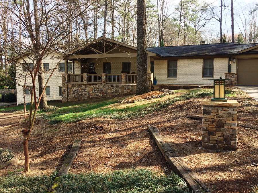
And the first “after…”
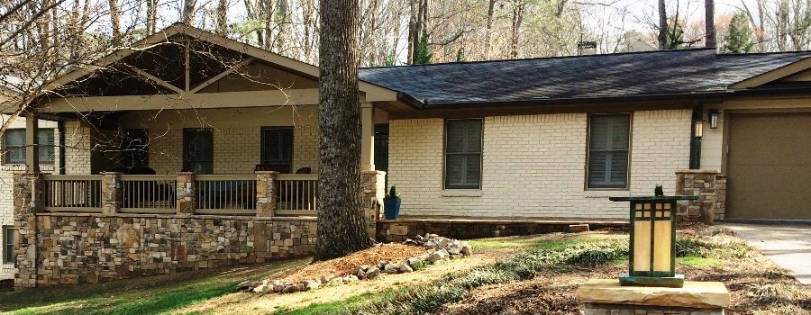
In this photo you can see the extensive work that was done on the exterior of the home, not to mention the painted brick! They turned a 50’s split level into a rustic Craftsman style with the wood accents, stone, railing and columns. Beautiful! Also, here you can see another of the blueish/green lanterns that sits atop another stone column in the front yard. And how ’bout that paint job! So warm, natural and inviting. And it’s not pink!
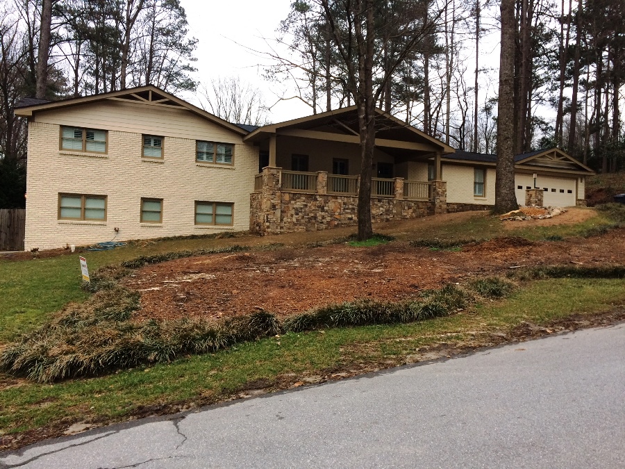
But I wasn’t happy with the photo. It was not the same orientation as the “before” shot. I asked Chip for another one. Here is what he provided:
Ok, much better on orientation, but it was taken on a cloudy day. Because of the overcast skies, the colors are not as vibrant and do not read true. I sheepishly asked Chip for another shot. (This is where I can get VERY annoying.) Here is my email to him:
Hi Chip,
I know you are sick to death of me, but I still don’t have the one shot I need of your beautiful makeover. I thought you might be able to take one today while we have a sunny day.
Although you have sent me many great photos, the one I still don’t have is a full shot of the house in the same orientation/sweep as your “before” shot, which I’ve attached. The problem with the other photos I have is that they don’t “match up” to that shot.
Here is what I need:
1. Same view as your “before” photo
2. Take the photo when the sun is shining on the front of the house
3. Leave a little extra space outside the home on both sides, top & bottom. I can crop as needed.
4. Maybe one more landscape shot of your front door which captures surrounding painted walls and some of the stone. The one I have is just of the door itself. Love the color!!!
Chip, if this is too much trouble, I understand. Don’t worry about it. It’s just that your transformation is so nice, I would really like to feature it on my website. (I’ll add you to my email list so you can see it.)
Thanks so much! Again, sorry to be so much trouble.
Patsy
But he could not have been more gracious. He went back outside with his camera yet again and I finally got the shot I was looking for:
What a remarkable exterior transformation! I applaud Chip and Tim for the fabulous work they did on their home long before I arrived and thank them for allowing me to help with the finishing touches. And thank you, Chip, for laboring over the photos until we got a great representation of your “new” home. Well done!
