It’s time to talk about Color Trends for 2018. I was thinking just the other day that it was only a couple of years ago that four major paint companies — Sherwin-Williams, Benjamin Moore, Behr and Valspar — all selected whites for their color of the year. They definitely hit the nail on the head. I’ve done numerous “white” color consultations since then, both for interiors and exteriors; but change is in the wind. To illustrate, let’s take a look at the 2018 Colors of the Year.
We’ll start with Sherwin-Williams.
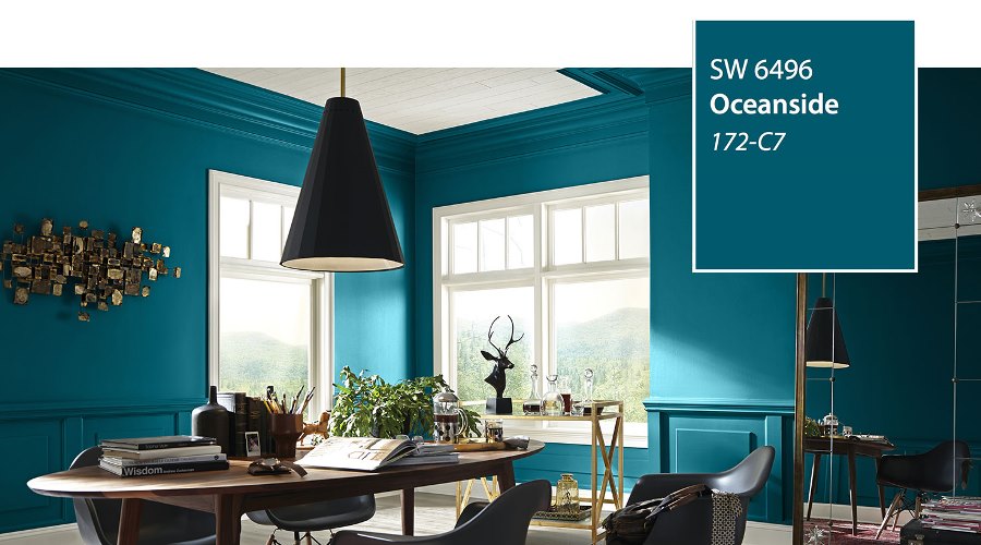
Lovely! I’ve been hearing all year that jewel tones are hot, hot, hot. Here is exhibit A with Sherwin-Williams’ 2018 Color of the Year – Oceanside SW 6496.
I’ve been at this color thing long enough to know that there is an ebb and flow to color. Since we have been trending toward white for the past couple of years, things are now headed in the opposite direction. That’s not to say we are done with white. People are still transitioning their kitchens from dark cabinet stains, dark granite and taupish/brown backsplashes to white and taking their walls to white; but as we tire of white, the backlash is to head toward darker colors such as Oceanside. It would be beautiful in a dining room or as an accent cabinet color.
Next, let’s take a look at Benjamin Moore.
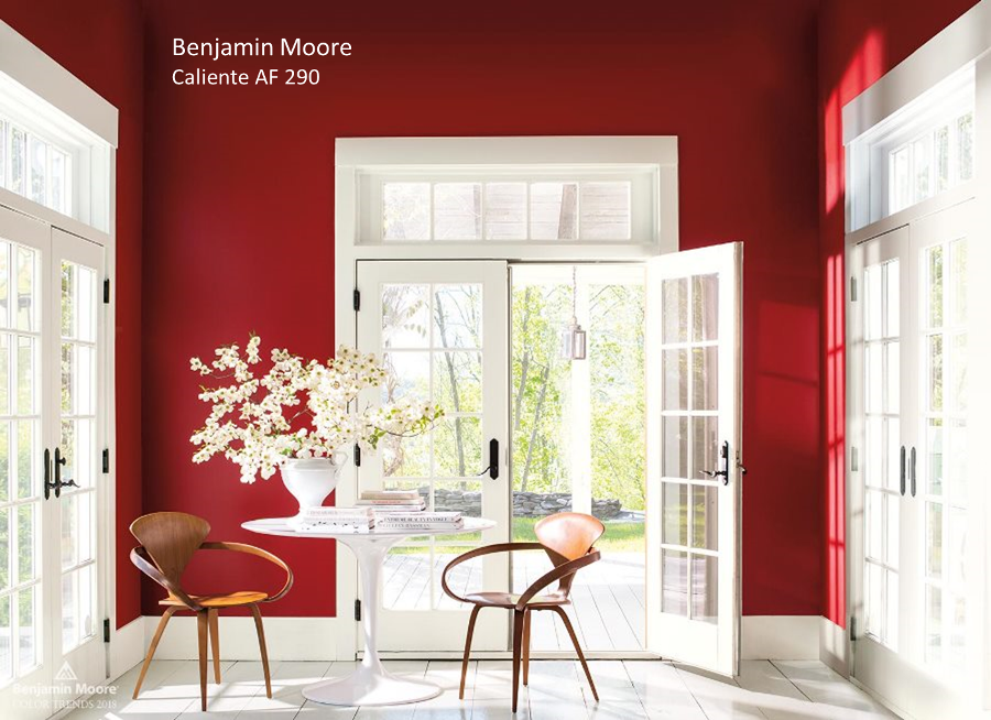
Ah, ha! Another jewel tone! If you haven’t gotten around to repainting that red dining room you are sick of, maybe you should hold off — it’s back in! Benjamin Moore’s 2018 Color of the Year is Caliente AF 290. Actually, this makes me very happy since red is my favorite color. I will always have it in my home de’cor and also in my closet. Red is always stunning against a stark white trim, as shown above, and would look great as an accent wall or in a powder room, in addition to a dining room.
Next…
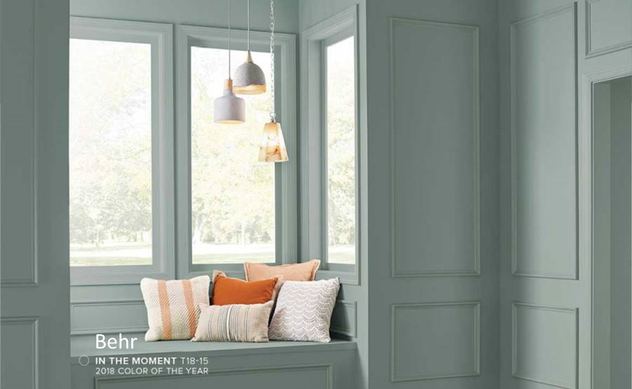
I must say, Behr’s 2018 Color of the Year, In the Moment T18-15, is a bit of a surprise. Why? Because it’s not heavy or strong enough to look like something new or different. The strong jewel tones as represented in Oceanside and Caliente are more what I would expect, and there is another one coming below, so this hue is a bit too muted to make a statement of strength. That’s not to say I don’t still specify blue/greens for my clients. I do. I believe that blue/greens, given their soothing calm, will always be around. I actually have my entire home painted right now in a light blue/green (Sherwin-Williams’ Sea Salt, SW 6204) that I never tire of.
Finally, let’s take a look at PPG.
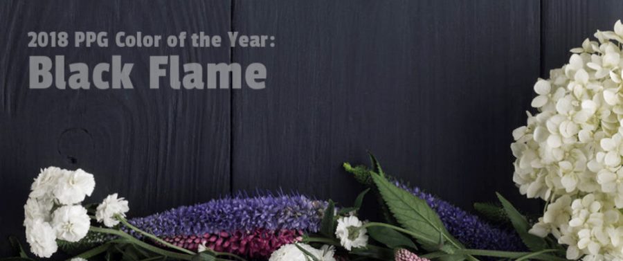
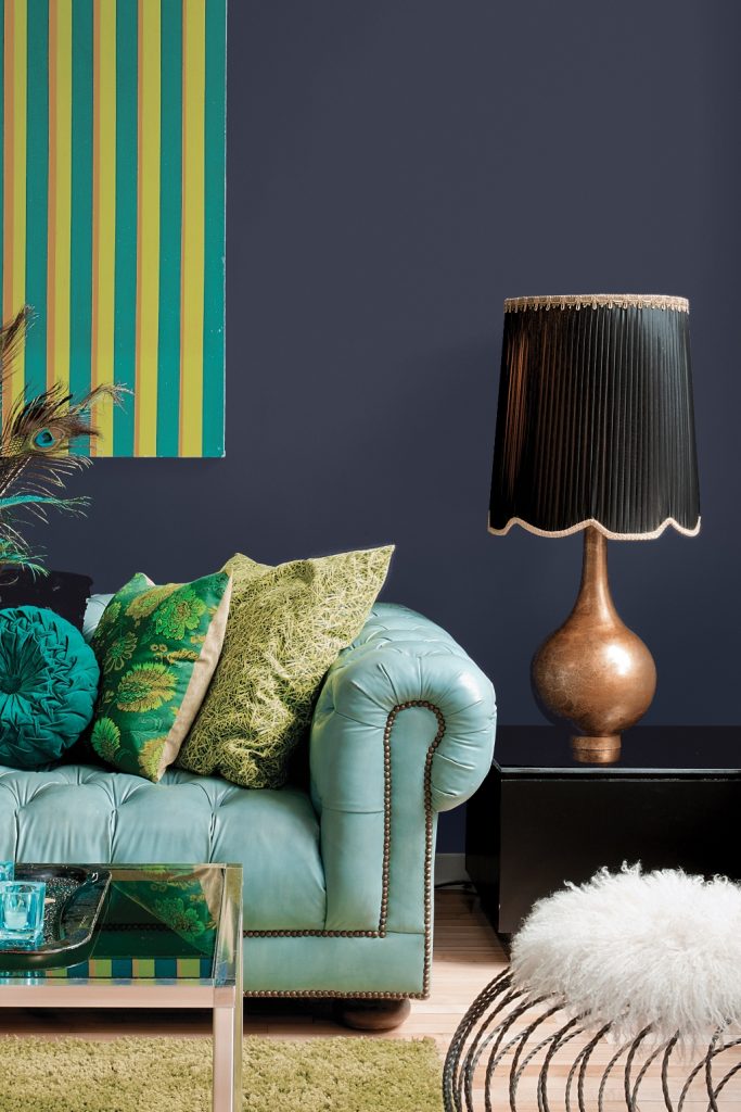
Here we are back to another hue that looks like a backlash to the whites of the past couple of years. As you can see in the above photo, PPG’s 2018 Color of the Year, Black Flame PPG1043-7, has a good bit of purple in it. You can really see it against the stark black of the lampshade and end table. Black Flame looks great as a backdrop to brighter colors, as shown above, and would also work well played against a crisp white. It would look fabulous in a study or dining room.
So what do you think of the 2018 color trends? Are you ready to change your wall colors? Here is the best advice I could give you on the subject: use new “trendy” colors in small doses — in accent pillows, on a small cabinet or in artwork. Sprinkling a few of these colors around with your existing de’cor without going overboard will make your house seem “on trend.” Of course, I’m assuming you no longer have avocado green appliances and pink & green chintz fabrics; but if you do, don’t worry. Give it a little time and they, too, will be back!
