Are you afraid of color? I thought so. Know how I know? I’ve been around the block a few times with this color thing and I’ve learned that most people fear color more than they fear death or speaking in front of a live audience. Such was not the case with this homeowner.
Several months ago I was called on by a local painting company to help “Jane” in Sandy Springs select new paint colors for her home. Here is what I saw when I arrived for the consultation that day:
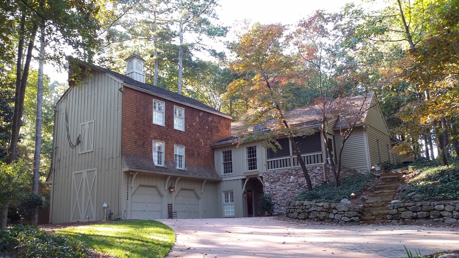 What a pretty setting. This is an older home that has been added on to several times over the years. As a result, the architecture is quite unique which makes it a one-of-a-kind home, which is also what presents a few problems in trying to unify the many elements. Is it a house or a barn? What’s with the wall of cedar siding above the garage doors? Should that be considered siding or shakes or cedar siding shakes? How do they play with the roof color? Are there two roofs? Notice three sets of stone accents: one on the wall of the home, one at the base of the yard and another as the steps. And what’s with that little thing sitting on top of the roof? In this case, we had way too many fixed elements to tie together.
The first order of business was to listen to the homeowner to hear what direction she wanted to take. Unfortunately, Jane had no idea other than she wanted a change and a good look. In studying the house, I was struck by the fact that it had no distinction. The colors sort of faded into the woodsy setting and there was no contrast. After discussing “the look” a bit more and learning that she was not afraid of color, I had an idea. Here is the palette Jane and I arrived at:
- Body: Retreat – SW 6207
- Trim: Moderate White – SW 6140
- Accents: Oyster Bay – SW 6206
When I left her home that beautiful fall day, Jane was excited about what was to come.
A month or so later, I was getting ready for work one morning when I received a text from Jane. “Patsy, the painters are here. The job is underway. I’m ecstatic! But what do we do with the structure on top of the roof?” A photo was attached:
 Ah, yes, the cute little house sitting atop her roof with the weather vane perched at the highest point. It should be painted to look like a replica of the house with the body in Retreat and the trim in Moderate White.
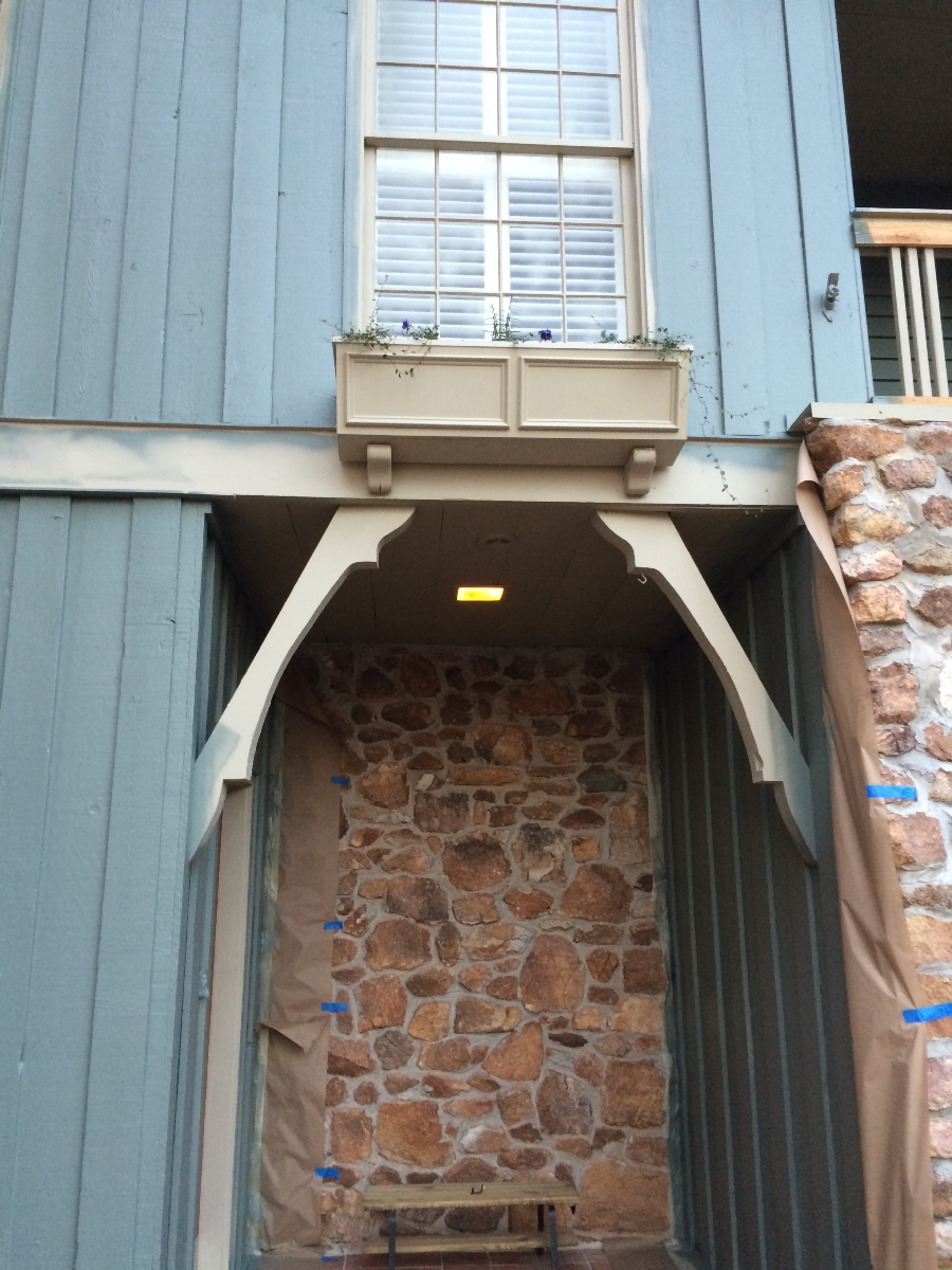
Then I received another text. “Patsy, what about the window box? The painter said it should be done the body color.”
While that would not have been a mistake, I thought it would be more interesting and more of an accent to paint it the trim color.
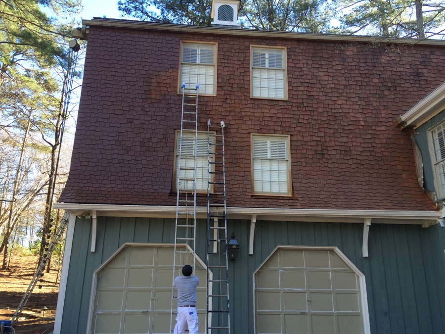
And, finally, there was the wall of cedar shakes to contend with.
By the time Jane sent me this photo, most of the body color was up. The original plan was to color match the cedar shakes to their existing stain, but Jane wasn’t buying it. The blue/green body color caused the orange shakes to brighten and intensify. At her request, I stopped by the house later that day to get a better look. I actually liked the way the colors played together, but it was Jane’s home and she needed to be happy with it, right? She chose to darken the shakes with a deeper solid stain. In the picture above you can see that the shakes to the left had been treated with the new solid stain while the shakes to the right were still the original.
Several days later, the job was finally completed. Here is the “after” shot:
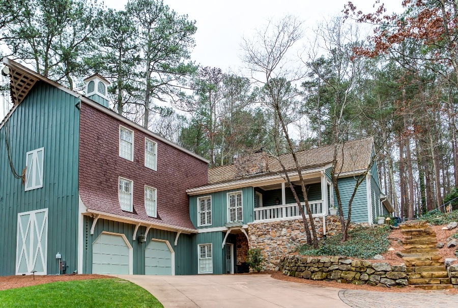 The home no longer faded away but now had its own identity. Jane emailed me later with these words: “The house looks amazing! The neighbors are ALL commenting on how updated the home looks. One neighbor said yesterday that it’s the perfect color in keeping with the style of the house and reminds her of the Hamptons!”
If you are about to paint your home, don’t be afraid of color. The process can be painful, but the end result is well worth it.
