In the past several weeks several major paint companies have come out with their own selection for 2019 Color of the Year. (If you would like to review last year’s choices to see if they were hit or miss, take a look here.) To see what Benjamin Moore, Behr, PPG and Sherwin-Williams are predicting for next year, keep reading.
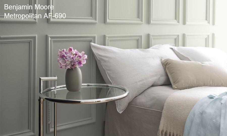
First, let’s take a look at Benjamin Moore’s choice.
Metropolitan, to me, is a “safe” choice. It is not far afield from where we have been. While the gray trend is just about over (you knew that, right?), there are certain colors that are timeless. This is one of them.
Here is the official Benjamin Moore description of the color:
“Metropolitan AF-690 emanates nuance, harmony and extravagant ease. Always adaptable, it softens to matte or shimmers with sheen. It’s neutral. It’s understated. It just is. This is color, off-duty.” Ellen O’Neill, Benjamin Moore & Co.
I might simplify that to “understated elegance.” This color is the essence of Ben Moore in a paint can.
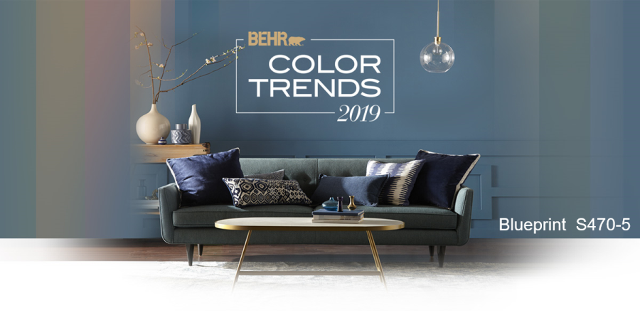
On to Behr.
In case you weren’t aware, hues of blue are HUGE right now. Whether they are showcased on front doors, kitchen cabinets, dining rooms, accent walls or furniture they can be seen everywhere. Knowing that they are here to stay for a few years, I feel this selection of Blueprint S470-5 is right on point. Are you beginning to use deep, rich blues in your home? If you aren’t ready to paint your dining room blue, begin by using it in small doses such as throw pillows or artwork.
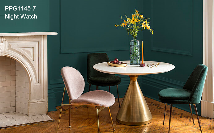
I read a High Point market recap last week which said that blues and greens are everywhere, which would explain the next 2019 Color of the Year from PPG Paint.
How fabulous is Night Watch? I LOVE this! A couple of years ago the word was out that jewel tones were coming back. I believe they are now here in full force.
I’ve now been doing the color thing for eight years and have learned over time that there is most definitely an ebb and flow to color. With whatever is “hot” at the moment, there will always be a backlash in the next year or two.
When I began to work in color in 2010 we were on the tail end of the brownish/tan Tuscan era. The backlash to tan was gray, which is where we were for five years. Then a couple of years ago there were four major paint companies that all came out with shades of white for their Color of the Year. We have definitely been on white overload, both inside and out. So what is the backlash to white? Black. PPG’s 2018 Color of the Year was Black Flame. Black has been out in full force for the past year. It is everywhere used as both interior and exterior accents along with white. So what would you guess the next color trend would be after white and black? Color. When everyone is tired of color, it will be back to neutrals and the cycle will start all over again. It’s an interesting study.
But I digress. On to our last 2019 Color of the Year from Sherwin-Williams.
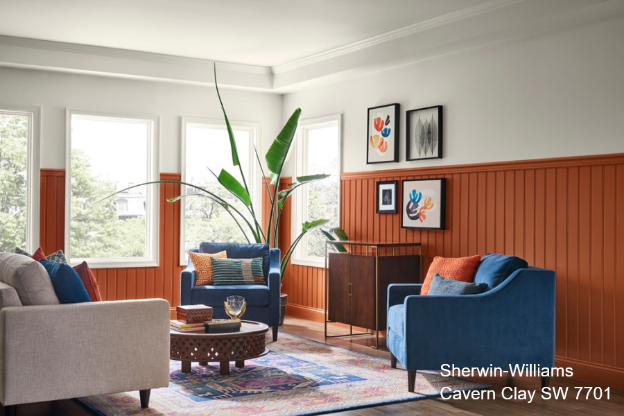
This is certainly a departure, wouldn’t you say? Actually I think Cavern Clay is a wise choice. Why? I’ve already stated that blues are everywhere. What is the perfect compliment to blue? Orange. (If you didn’t know that, then you need to come to color class so I can teach you lessons from the color wheel.) Did you notice the blue chairs in the above photo paired with the orange of Cavern Clay? Point taken.
A few notes from the Sherwin-Williams website on Cavern Clay:
Cavern Clay is a nod to midcentury modern style, but with the soul of the American Southwest, which together creates a desert modern aesthetic. This warm, earthy hue is both casual and refined. It can be the backdrop of a playful, welcoming dining room or kitchen when paired with bright tiles, warm stone and sculptural greenery.
Interestingly enough, I have specified hues very similar to Cavern Clay several times recently for front doors.
And those are our 2019 Colors of the Year from Benjamin Moore, Behr, PPG and Sherwin-Williams.
